Selecting the Right Bathroom Flooring

Are there any spaces we use more in our homes than our bathrooms? Maybe not! They’re highly frequented areas. For that and so many other reasons, they deserve special treatment, in my opinion. I have always believed my job as an interior designer was to layer both beauty and function in the spaces I touch. If your home is attractive but purposeless, it is no good to you. Bathrooms are awesome opportunities to see how great design can both make a stunning statement and enhance utility. If you’re looking to select the right bathroom flooring, this is for you! It’s easier than you think, and I’ll walk you through the important aspects to consider in this blog.

Don’t Negate the Function of the Flooring

When designing any room, the surfaces are always a priority. This is because they are often the elements that cover the most square footage. They’re also the parts of the room we interact with most, even if we’re not always conscious of it. Think about it, you walk on your floors, cook or eat on your countertops, and touch your walls every day. That’s a LOT of wear and tear. So selecting the right components is essential. In order to do that, you need to consider how the space will be used. When I’m designing a bathroom, the first thing I think about is how slippery the floor can be. Bathrooms are havens for moisture. The last thing you want to do is take a bath or shower, step out and go sliding across the room! This is where hiring a designer with expertise in this area comes in handy! 

Grout and Grip

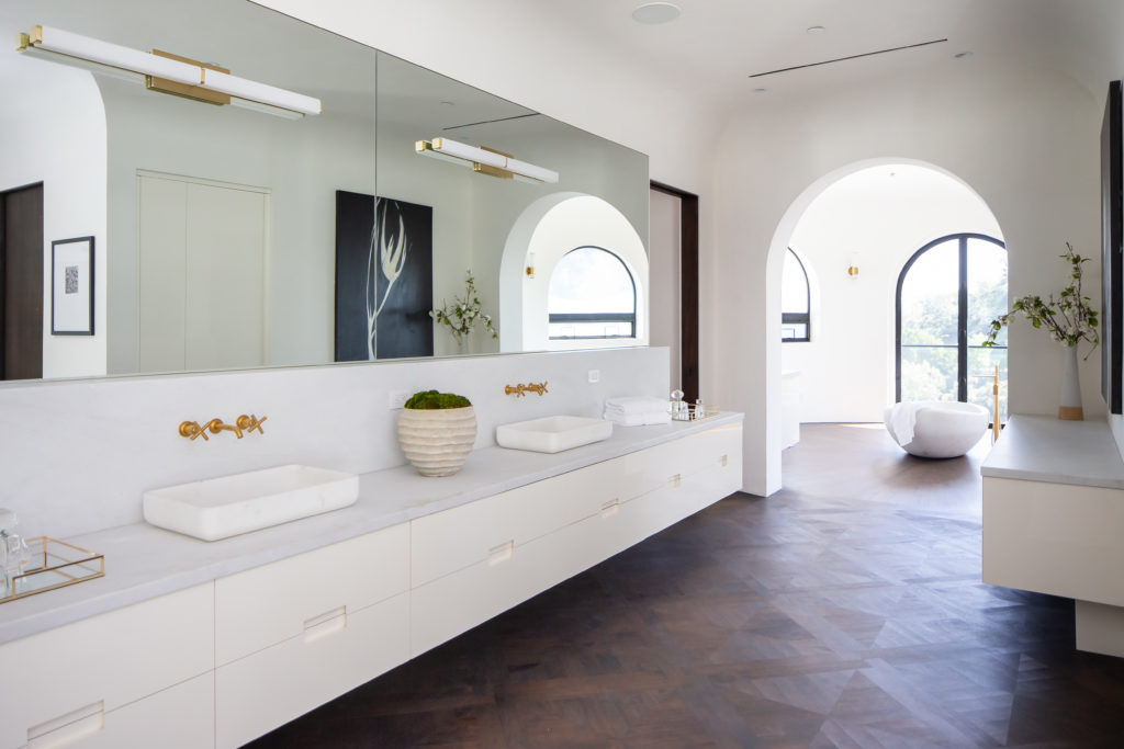
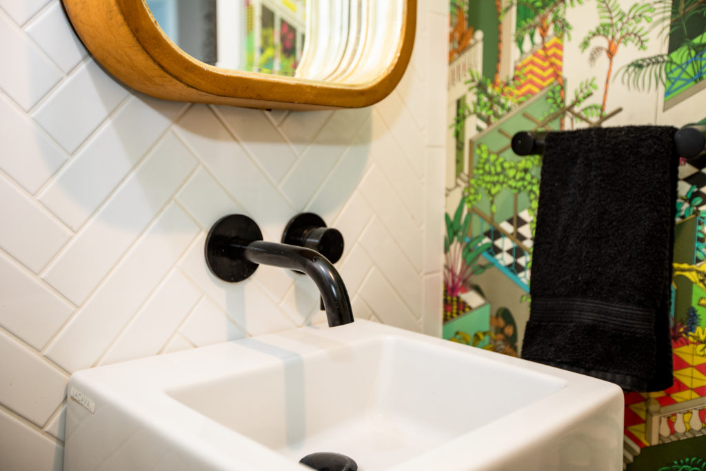
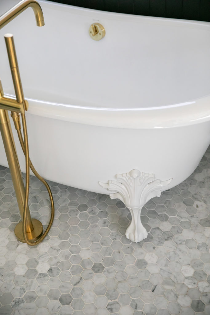
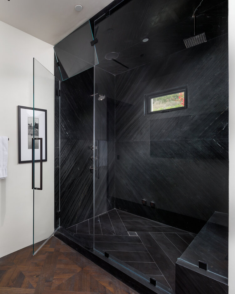
One of the best ways to give your bathroom flooring a bit of necessary grip is to take advantage of grout. Seems like a no-brainer, right? Grout fills the spaces between your tile and gives them a more polished look once all the pieces are set into place. But, it also provides a bit of traction, and that’s precisely what we’re after in a space that is often wet and slippery. You can also take advantage of patterns with tile in order to gain a little grip on your bathroom flooring. I laid subway tiles in a herringbone pattern to do this, and it gave the floor a little more personality. 

Tile Patterns Add Personality

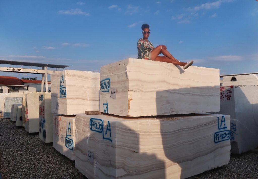
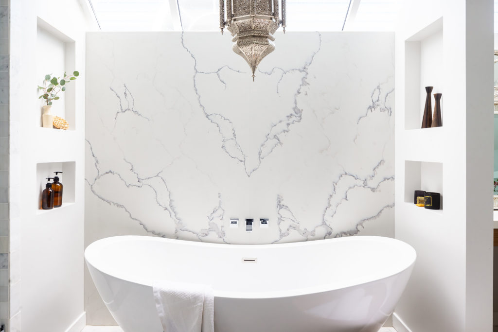
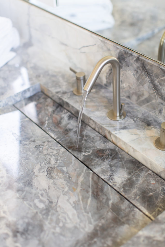
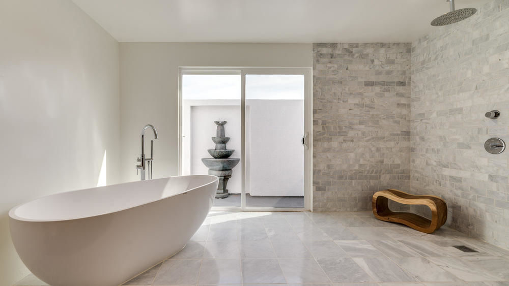
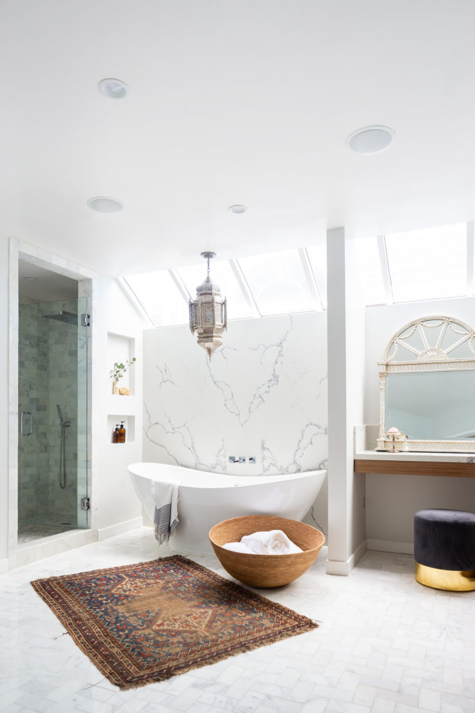
My signature design style is best described as “modern approachable luxury.” I spend a lot of time finding unique ways to infuse spaces with opulent touches, and that often includes stone and stonework. I sourced stone directly from Italy when I was designing UNICA. Getting up-close-and-personal with so many different types of stone was divine. I used it in many of the 21 bathrooms inside the Bel Air estate. So when I sit down for a 1-on-1 design consultation with a client, they often want to incorporate stone, whether natural or manufactured, in their bathrooms, and often, their bathroom flooring. I love using slabs of stone for bathroom walls, but bringing it onto the floor in slabs is asking for skating rink conditions! Instead, opt for tile with texture and interesting shapes. If you’re using marble or another stone on your walls and you MUST have an exact match of it as your bathroom flooring, have tiles cut from the slab instead of bringing it onto the floor intact. 

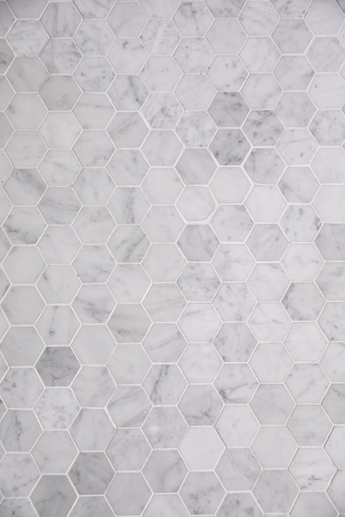
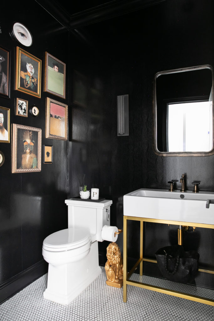
There are so many different types of tiles and even more options for patterning. I love penny round tile, and I’ve used it in several projects. In fact, penny rounds and hexagon tiles are my favorites for shower floors! You can also use subway tiles in a chevron pattern for an impressive look that simultaneously grants you the advantage of that “grippy” grout! If you can dream it, you can achieve it with tile. I’ve even used tile in patterns to create designs and focal points in bathroom flooring. These are just a few ways you can style the bathrooms in your home!

Bathroom Flooring Color Choices

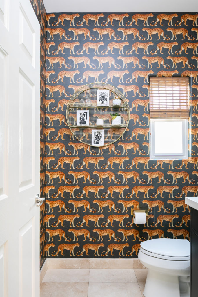
Color is always among the first considerations for surfaces in a home. Bathroom flooring is no different. I urge my clients to select tile and stone in neutral hues. Our bathrooms are great places to play with color. I especially love to have fun with bright and whimsical designs in powder rooms. That means I often install colorful wallpaper and paint in these spaces that make striking first impressions. Remember, surfaces occupy the most real estate. So playing with color is easier done with techniques like wallpapering and painting, because they’re simpler to swap out when you’re no longer enamored by your choice. Ripping out tile and stone? Not so much! 

Go with neutrals for your bathroom flooring for maximum versatility. Whites, creams, grays and the like will always complement the other colors you decide to include in your bathroom. Many types of tile even feature a gradient of color, and that will only add to the visual interest!

You and your family visit your bathroom several times each day. Make sure it’s beautiful, functional and tailored to your needs. Keep these tips in mind when you select your bathroom flooring.

Hire an Interior Designer: Closet Design

All aspects of interior design interest me. So, when DIY home projects started taking over the internet by way of short form video content and capturing the interest of even people who previously weren’t design enthusiasts, I was all ears (and eyes!). I love that so many are fascinated with the role interior design plays in the way we live our lives.

The total metamorphosis that we see at the literal snap of a finger in these short video clips can be satisfying. But, they aren’t always the most realistic depictions of the work required to get the effect you desire. Some home projects, like closet design, necessitate a lot of planning, proficiency and precision. That’s the kind of task you hire an interior designer to do. I’ve helped so many clients bring their design goals to fruition, and I’d love to do it for you, too! Some things are truly better left to the pros, and I’ll show you why.

Interior Design Isn’t Instant

We’ve all seen it. The super quick and almost unimaginable TikTok videos and Instagram reels where an incredibly skilled person starts out with a tiny dog house and in a single day transforms it into the Louvre! Okay, okay. Maybe that’s a bit of an exaggeration. But, the point isn’t lost on you, I’m sure. Everyone, including interior designers, loves a good “before-and-after”. There’s just something magical about seeing a space become all it can be, especially when others had no idea it could. But when you’re dealing with a project like closet design, there are a ton of less glamorous factors you don’t always see in the produced and edited video clips.  When you hire an interior designer, you not only save yourself the headache of figuring out things outside of your wheelhouse, you save yourself TIME! That’s worth it.

Hire an Interior Designer

Aside from the seemingly impossible timelines, one of the reasons so many are amazed at these home renovation/makeover videos is because these projects typically demand a great deal of expertise. I advise clients all the time to enlist the help of a professional when they’re looking to design their closets for this very reason. Often, people don’t consider the danger that cabinetry can possess if it isn’t mounted properly. Most closet systems need to be anchored into the wall to truly be secure. You run the risk of running into several dangerous scenarios if you aren’t skilled in this department. Think about it. Children love to climb on things. In our haste, we often snatch garments off the wall instead of gently removing them. Even the sheer weight of the clothes in our wardrobes can become a hazard.

Even as a designer, I choose to trust the experts who have the knowledge and experience with working with corners and positioning specific to wardrobe design. It ensures every detail is perfected. The logistics of closet design are equally as important as the aesthetic appeal. Working with an expert is the best way to guarantee you get the look and function you’re after.

Don’t Take Shortcuts With Your Closet Design

One of the biggest mistakes people make with closet design is attempting to shortcut their way through it. Closets are something we use daily. I always encourage my clients to invest in highly trafficked spaces. Because closet design can be expensive, it can be tempting to DIY, or to settle for a cheaper alternative. Resist the urge! The cost of repairing a botched renovation will eclipse the price you will pay an interior designer to do it correctly the first time. There are several available avenues if you’re looking to design or redesign your wardrobe. You can always go directly to an interior designer. You can even visit a major wholesaler! Many of those stores employ in-house planners. They assist customers with their desired designs. Select the option that best works for you! And, be specific with your expert regarding what you want and need out of your closet. 

Seeing everyone enjoy interior design brings me joy. I’m continually impressed by the skills of all these amazing people! More and more we’re all realizing the power our homes have. I believe that’s one of the factors driving all the interior design projects. I’m tipping my hat to all the talented, creative people out there. But, unless you happen to have an abundance of skill in these areas, hire an interior designer. It will make your life easier, and who doesn’t want that, right? What’s your favorite type of home design video to watch? Leave them in the comments!


Stone: The Next and Forever Design Trend

“What’s the next big design trend?” It’s one of the most frequently asked questions for any interior designer. The answer will vary from year-to-year, and even often season-to-season. But there are a few interior design elements that will transcend trends and forever be in vogue. Stone is definitely one of them! So, because stonework and stone elements often find themselves on the tops of these “must-have” lists, I thought it would be helpful to give you a few ways to incorporate it in your design and spaces. Let’s dive in!

Using Stone in Interior Design

It’s no secret that I love using stone when I’m designing. It has a way of instantly adding a layer of sophistication to a space. I like to think of stone as effortless decoration. The various colors and veining mixed with the sheen or shine each material possesses makes it feel elegant. So it’s no wonder many look to utilize it when they’re designing a room. In fact, when I designed UNICA, a modern Spanish villa located in Bel Air, California, we used marble in several places. One of the most unique techniques we took advantage of is called bookmatching. As you can see in the photo above, bookmatching involves positioning two slabs of stone in such a way that they look almost as if they were pages of an open book. We matched the natural veining of the marble, and the result was nothing less than majestic!

When people are drawn to stone, I often believe it has something to do with its natural qualities. We’re seeing more indoor and outdoor living spaces linked by continuous design as so many of us are longing to spend more time outside. The great outdoors and all it has to offer fresh air, greenery, bodies of water, can be quite soothing. When we bring natural elements into our spaces we often benefit from those same serene sensations. That calming effect helps to bridge the indoor-outdoor gap. These reasons and so many more make stone a no-brainer for those who love it like I do.

Ways to Incorporate Stone in Your Home

What’s the first thing you imagine when you hear the words “stone” or “marble”? For many it’s a huge bathroom in a luxury hotel or the floors in a mansion. It’s true, you may very well find stone in abundance in those kinds of places, but those aren’t the only ways to use this material in interior design. I love using it in kitchens! My own kitchen has stone countertops and a stone waterfall island that I adore. Stone is perfect for these surfaces because there are so many different options of colors and patterns to choose from. Whether you’re looking for a pristine white, or a rich black, the selections are there. There are also different variations in each color family. A white marble might have grey veining, and another might have blue veining. You can choose the one that works with the color palette in your space.

One of the less conventional pieces of advice I give to my clients is to consider using stone as your backsplash instead of traditional tiles. I know, sounds strange at first, until I show them examples of my work. Running a slab all the way up the back gives such a magnificent look to the area, and it also makes it easier to clean! Another great use for stone is in bathroom fixtures, both large and small. I custom created a tub from a single block of marble, and it gave the entire room a luxurious feeling. I wanted the owner to be able to soak in stone, and ease the cares of the day away. The above-counter marble sinks I created for that same space are pictured below. 

Stone Doesn’t Have to Break the Bank

As an interior designer, I’ve been blessed to use stone in several projects. I’ve used it on a bar program in a restaurant, and I’ve even used it in flooring: limestone in an oversized opus pattern. Those projects were costly, indeed. I even traveled to Italy to source and interact with the materials. But, if you are looking to use it in your home without spending a fortune, I’ve got the suggestions you need! Consider lighting fixtures that feature stone. I’ve seen beautiful sconces with marble detailing. One of my favorites picks years ago from High Point Market was a gorgeous chandelier with slate pieces crowning the top. 

Easy Ways to Incorporate Stone in Small Formats

If you want to give your space an easy refresh without the crazy price tag, I often tell clients to switch out door pulls and handles. There are beautiful knobs made of stone that give a space just the perfect amount of dazzle. The options really are endless. Whether it’s a lamp base, a table with stone inlay, or even marble coasters that you elegantly display on your coffee table, adding stone to your space instantly elevates the design. Don’t be afraid to play around with different types of items in your space.

Should You Use Natural or Manufactured Stone?

One of the biggest considerations is whether you should go for marble or manmade stone. The answer lies in your lifestyle and where you intend to use it. Years ago, manufactured stone was an instant “no” for me. It looked unrealistic, and nobody wanted that as an effect when creating an otherwise beautiful space. Nowadays, the technology is so good that you would have a hard time differentiating between the two! Natural marble has an undeniable beauty and a connection with the earth that is one-of-a-kind. There is something magical about knowing this material was formed in the earth, and if you’re a lover of crystals like I am, you might even believe in the healing and grounding qualities it can hold. If those things are important to you, then natural might be the way to go. 

If you’re going to be using stone in places where spills are likely, like a kitchen, you might want to consider manufactured stone. This is because it’s easier to clean, and won’t stain or etch as easily as natural stone. Natural marble has to be sealed periodically to maintain a protective layer. I’ve found that parents with young children tend to think about those things before making a final decision. I always say your home should work for you. Your spaces should be more than just beautiful, they should make your life easier. In my opinion, that is the ultimate deciding factor between natural or manufactured. 

Trends in design will always be a thing. What’s “hot” this season will quickly be replaced by something new next season. Stone will stand the test of time. Think of the streets of Italy. They’ll always be iconic and classic, because they’re made of a material that never goes out of style. If you’re looking to add a dash of refinement to your home, stone is an amazing way to do it! 


Graber: The Window Treatments You Need

When you walk into a space, what’s the first thing you notice? I’d be willing to bet that the windows and the light they provide are definitely somewhere at the top of the list. I’m always looking to find ways to update my own home. If you know me well, you know my expectations are high! I want every piece of décor to be not only stylish, but also to enhance my quality of life. I shopped around for months on end and never found the perfect solution. I was ecstatic when I found Graber! I can’t wait to share all the things I love about my new window shades and the overall experience. I think you’ll love them, too.

Custom Window Treatments from Graber

One of the most common questions I’m asked is regarding easy ways to add luxurious touches to a home. It’s an easy question to answer, because my signature design style, “modern approachable luxury,” relies on my belief that luxury is something that can and should be attainable to everyone. In my opinion, luxury is in the details, and nothing could be more detailed than something custom-built for your home. Whether I’m designing for myself or a client, I tailor the space to the needs of the people who will spend time there. 

Functional items within a home become that much more beneficial when you can control how they serve you. I was amazed at the sheer amount of options Graber offers as I looked to outfit my home with new window treatments. You can customize practically everything! Graber builds custom window treatments and you select the materials, color, hardware, liner, size and control type. And, once you’ve decided on those features, they’re made to order, ensuring you get exactly what you want and need. 

Graber Solar Shades

I immediately fell in love with the solar shades option because it felt like the perfect addition for my home. Have you ever been engrossed in your favorite tv show only to have to suddenly squint or shift to another part of the room because of the glare on the screen? Graber Solar Shades are designed to reduce glare! Not only is that great for our electronics and screen-viewing, but it also helps prolong the life of delicate fabrics and materials. For a designer, that’s awesome news! Nobody wants to spend money on a beautiful piece of furniture only to have it fade from sun exposure.


Graber has truly thought of everything. You can select the fabric that works best with your color palette and even choose your “openness.” That means you can select the amount of sunlight you prefer to enter through your shades. The lower the openness, the more UV rays they block. The higher the percentage of openness, the better view of the outside you will get. Isn’t that spectacular? I love this feature because it allows the customer to decide how much privacy and sunlight they want in their home. I can protect my space from excess heat while still enjoying a gorgeous outdoor view. These shades are definitely covering all my bases!

The Graber Experience: Easy Does It! 

Perhaps one of my favorite parts of the Graber experience was how easy the whole process was. I’m accustomed to long, convoluted procedures when it comes to all things interior design. Often, it takes several people, multiple days and extended deadlines to complete an element of a redesign. With Graber, I was done in less than 30 minutes! Graber offers a one-on-one dealer home visit that can be in person or virtual. They even have a visualizer tool to better help you imagine how your window treatment will look in your home. 


During the home visit, the dealer will walk you through all of Graber’s offerings and answer any questions you may have. I appreciated the fact that I got to leave the measuring to the experts, so I never worried about making a costly mistake. In less time than it takes to eat lunch I had ordered beautiful new shades and a modern-looking design I love! A short second visit later, and my new shades were installed and working perfectly!

UltraLite Lift System

One of my jobs as an interior designer is to stay abreast of all the design trends, styles and décor offerings. I’m always looking to bring the very best the design world has to offer to my clients. Nothing makes me feel better than when I can recommend products that I love for my own home! Graber offers a modern take on a cordless lift system called the UltraLite Lift System. This innovation allows you to lift and lower the shades with the lightest touch. That’s right, it’s really that easy! 

I rejoiced when I learned about the Ultralite Cordless Lift System because it was exactly what I’d been waiting for to update my window treatments. Remotes weren’t an option for me because, simply put, they get lost in my household! Blame it on two energetic little ones, but I knew we would benefit from a clean, minimal design that was effective. And we did! Cordless window treatments are also the safest option for households with children and pets. It’s also a sleek, contemporary look that won’t clash with any other design style in a room.


I find that people often underestimate the impact window treatments have on a space. Our windows provide ambient light, but they do so much more than that when paired with lovely decorative elements. Graber knows that we shouldn’t have to sacrifice beauty for function. With their plethora of options, you simply can’t go wrong! When was the last time you updated your window treatments? Give Graber a try and beautify your space today!

Food Network: Bake or Break – Paris Bakery

It may come as no surprise that I’ve been working in creative fields since I was a kid! It’s true! HGTV and Food Network aren’t my first rodeos! Whether it was child modeling, painting and selling bookbags as a kid, owning my own retail store as a teen, or staging yachts early on in my career, creativity is something I just…get. So, when I got the call from Food Network to help another struggling bakery revamp their design to maximize selling potential, I was over the moon excited to help with innovative ideas! When I arrived in Livonia, Michigan, I was immediately struck with several ideas about how to improve the space. So, let’s talk about this week’s finale of Bake or Break!

Choosing the Correct Color in Retail Design

There’s a reason so many interior design tips involve the use of color. Interior design is largely visual, which means what we see when we first enter a space matters big time! We can use color to draw attention, to influence moods, and even to make a space appear larger or smaller. When I walked into Paris Bakery, I was instantly aware of how dark everything was. Kostas, the bakery owner, had painted the walls a deep red color. It was somewhere between brick and ruby. Now listen, I have nothing against red. But, I do think it can be tricky to use on walls. In fact, any darker color can be. The deep hue he’d chosen was making the space feel oddly closed in. It wasn’t the effect you want when the goal is getting customers to buy food and hang around for a while.

A doughnut is transformed into a bright pop of color, as seen on Bake or Break, Season 1. Photo by Ida Edelman


Full of inspiration, I sprang into action. When you’re designing a room, you always have to be careful to balance dark and light elements. It’s part of the reason why tuxedo kitchens work so well. Light usually opens up a space, while dark has the opposite effect. Keeping your walls light will trick the eye into thinking the room is bigger than it actually is, something you can benefit from in a smaller space like this bakery. We set out with a plan to brighten the entire place with a fresh coat of white paint, and the result was exactly what I hoped for!

Always Take Advantage of Natural Light

As I surveyed the space, I realized that a part of a wall jutted out in a way I’ve seen several times before. I instinctively knew (I mean, I am a designer!) that could mean a window was hiding beneath. A little investigating, (read: pounding through the wall) and we struck gold! Turns out there were windows after all! One of the biggest tips I can offer anyone looking to make a space feel open and spacious is to harness all the natural and artificial light you can. Whether I’m designing for someone on HGTV or Food Network, I always look to see how I can either arrange pieces for the best ambient light, or select lighting fixtures that will mimic natural light in order to create a welcoming space. To me, one of the most impactful changes we made to the bakery was giving it the ability to be bright and airy. Consider that if you’re buying a home, refreshing a room, or designing a retail space.

Personalize Your Space With Custom Design

Even after we brightened the bakery with windows and paint, it was still lacking something. Kostas was clearly very passionate about making this business. He felt strongly about what he had built, and he wanted it to be a success. His employees were dedicated and talented. Yet, the space seemed to lack personality. Design should be memorable. When I’ve designed restaurants in the past, I wanted to include touches that would make patrons think back to the amazing meals they enjoyed there. Interior design is powerful! I once took an image of a chef’s hands at work creating her culinary masterpiece, and made IT into a masterpiece! I enlarged it big enough to cover an entire wall, and it became a feature of the space. It was amazing to see the spirit and soul of the restaurant in art that way. I knew I could do the same for Kostas.

When I looked at the signage outside of the bakery, I felt inspired by the name. I thought about Belle Isle, a place known as the jewel of Detroit. We were able to find a beautiful print and turn it into wallpaper for the bakery. This simple but clever touch not only pleased Kostas, it gave the bakery life! My signature design style is modern approachable luxury. The luxury part is often in the customization that I aim to infuse in my designs. When you want to elevate the design of a space, think about the ways you can tailor it to you. That can be with custom finishes, colors, artwork or even appliances. With this art on the walls, this bakery would always feel a little more special than it did before. A bit of history mixed into the design? That’s a win.

Designer Breegan Jayne, Bakery Owner Kostas Charizanis and host Stephanie Boswell discuss the exterior transformation of a bakery, as seen on Food Network: Bake or Break, Season 1. Photo by Ida Edelman

Get Rid of Clutter in Your Space

If you watched this episode of Bake or Break on Food Network, you know the first impression of this bakery wasn’t a great one! There just seemed to be junk everywhere! Both Stephanie and I felt like the “stuff” overwhelmed the small space and took up precious real estate. After listening to the vision Kostas had of Paris Bakery being more like a café and having seating for customers, I knew we had to find a way to declutter the main area. I took the mismatched food cases and swapped them for matching ones. Next, I focused on configuration. We needed a free area for a bit of seating for customers. We easily did that by arranging the cases around the exterior of the room. Now, all of the “stuff” that was contributing to clutter was hidden to anyone who walks in!

Hidden Storage is Your Friend

I’m a fan of making furniture multi-purpose. We all lead busy lives. We need our homes and other spaces to work for us, not against us. Whether I’m designing a bedroom, baby nursery or retail space, I look for ways to incorporate hidden storage. Is your space full of items that you need, but don’t need (or want) to necessarily see each day? Use large baskets with lids! These are great because they’re attractive, and you can put them anywhere. We use them in our home to house blankets when we want to curl up on the couch. I also like pieces like ottomans that open to storage. I like using these for parents because they’re perfect for stashing diapers or wipes in places where moms always need them. When you use furniture items this way, you can clear space for a more aesthetically pleasing design with ease!

Paris Bakery gets a recipe makeover with a S’more Donut, as seen on Bake or Break, Season 1. Photo by Ida Edelman


The transformation of Paris Bakery was amazing. We took this dark and bland space and turned it into a gorgeous, bright and spacious store that felt fresh again. Stephanie helped Kostas and staff come up with delectable additions to the menu, and the entire feeling of the space was rejuvenated. If you haven’t already, check out Bake or Break on Food Network or discovery+. It’s sure to bring a smile to your face!

Styling Your Bathroom: Interior Design Tips

If I asked you to name the places in your home where you spend the most time, I bet the bathroom would rank pretty highly on the list. I mean, think about it. We visit our bathrooms several times each day for… all the things! It only makes sense that these areas are pleasing to the eye, right? I want my guests to have a beautiful place that feels comfortable, and I want my own personal bathroom to feel like a peaceful retreat. I achieve both of those things by styling bathrooms with intention and panache. The result is always divine, and my clients agree! I’ll give you all the interior design bathroom tips you need to do the same. Keep reading!

Selecting Bathroom Fixtures and Hardware

Bathrooms, whether big or small, all have something in common. They need fixtures! When I’m designing for clients I find that many people focus so much on a color scheme or theme that they forget the impression that the fixtures and hardware can make on a space. In fact, when people ask me how to update their bathroom spaces without a ton of renovations or exorbitant costs, I often suggest changing out the fixtures and hardware as a cost-effective option. Why? Because these small swaps make a huge difference! Best of all, the options are endless! So, where to begin?

Bathroom Fixtures: Small Changes, Big Impact

What look are you going for and what type of hardware do you prefer? Hardware comes in so many different colors and materials, and there are even more options for finishes. Spend some time browsing before you commit to anything. If your current bathroom has chrome faucets and controls, perhaps you’d like to go with black or brass tones this time around. I’ve seen a bathroom completely transformed by making simple changes like these. 

Even the knobs and door pulls are easily updated for a customized and polished look. Think about the design style in the bathroom. If you’re after a more traditional look, that will govern the type of pulls you install. Looking to add a little more personality to the space? Consider knobs that sport radical designs and colors. The effect you get is up to you. You can even decide on the finish of the hardware. Once upon a time, “glossy” was the norm. But today, you can choose from glossy, satin, brushed, matte and more! As if you need any more options, you’ll also want to decide whether your hardware is mounted horizontally or vertically depending on the shape of the pull you select. All of these details have the power to make your bathroom look brand new! So you see, giving your space a refresh can be pretty simple!

The Significance of Bathroom Surfaces

I would be remiss if I didn’t acknowledge the largest part of our bathrooms, and that would be the surfaces! I’m talking about the flooring, walls and backsplash. Due to the sheer amount of space these surfaces occupy, they are the ones that often grab our attention first. Once you’ve decided on the design style and color palette, choosing the material for these surfaces becomes a bit easier. I advise my clients not to go too bold with the color of flooring. The reason? Well, while swapping out a doorknob or handle takes little effort, ripping out the pink tile you thought you were obsessed with for a weird moment in time requires much more, AND it can be costly. Keeping your flooring choices to something versatile will allow you to change your bathroom design style often and give it a longer life. 

As I’ve said many times before, neutrals don’t have to be boring! While I don’t recommend bright colors for bathroom surfaces, I DO love adding sophistication with beautiful stone! Natural elements have a way of truly bringing a serene element to a space. Stone is a lovely accent on walls because it instantly makes the space feel luxurious. While I’m partial to white stones with grey veining, I have used several different types of stone in various projects over the years. They’re all lovely! I even love using stone as a backsplash instead of the more traditional tile options. Running the stone all the way up gives that area a seamless feel that I always appreciate. If you haven’t considered stone before, please do! Real stone is always available, but manufactured stone also offers many advantages. Stone can be used on counters, walls, backsplashes and more.

Choosing Color

Have you been following along with my Instagram reels? You should! I take you through the process of designing my dream beach home, and I share a ton of design tips along the way. I’m always amused when people express shock at my use of color in certain places in my home. I love neutrals in most of my living spaces because they make me feel calm and centered after being overstimulated with all the “life stuff” we all deal with day-to-day. However, picking specific places to indulge in brilliant hues is one of my favorite ways to give bathrooms personality. I do this with smaller powder rooms. 

If you’re looking to have a bit of fun, this is the way to do it! Have a half bathroom and don’t know how to design it? Go big or go home. Don’t limit yourself. I know painting walls black in a bathroom might sound strange, but it can be elegant and striking when done well. Bathrooms are also great places to do accent walls. We usually see that done in bedrooms, but who says it can’t work in other places? Get funky with cool wall art to give your bathroom design some character.

I create little jewel boxes for my guests to enjoy by using vividly colored wallpaper that catches the eye. Powder rooms are perfect for unusually patterned wallpaper or paint colors. Animals? Bold florals? Why not?! Have fun with it, and remember that things like wallpaper, paint and art are easily exchanged when you no longer want that particular look. It isn’t a permanent commitment, so you can rest easy knowing that you will always be able to switch things up when necessary.

We’ve been talking about the great deal of time we have all spent in our homes over the last few years. The truth is, there has never been a better time to invest in our spaces than right now. Creating an environment made for thriving is easier than you might expect. Prioritize the rooms you use the most. Bathrooms are definitely at the top of that list! These are just a few ways to style them for the effect you desire. Stay tuned for more soon! 

If you would like help selecting fixtures, choosing colors or finding the perfect wallpapers it’s really easy to book a design consultation with me through The Expert.


Food Network: Bake or Break – The Cookie Jar

I can’t tell you how thrilled I am to be doing my eighth show with the HGTV and Food Network family! We’ve tackled everything from building houses for deserving families on Extreme Makeover: Home Edition, to judging sweet confectionery designs on Holiday Baking Championship: Gingerbread Showdown! Now on Bake or Break, Stephanie Boswell is helping struggling bakeries regain their stride with her incredible pastry chef expertise, and I’m redesigning the spaces to maximize and complement all the retail success they’re after! It’s a show with a lot of heart, beautiful design and delicious desserts! Let’s explore the power of the visual demonstrated throughout the episodes!

The Cookie Jar is Born

The first Food Network episode of Bake or Break took us to Flint, Michigan. There, we met Teressa Morris, the owner of The Cookie Jar. Teressa went into business for herself after leaving her job in the auto business when that industry took a hit a few years ago. She hadn’t considered a career in baking until her son took the five-inch cookies she made to a local barbershop and they sold out within an hour. The sweet treat named the “Million Dollar Cookie” was an undeniable hit, and soon after so would be the case with her bakery, The Cookie Jar. Unfortunately, Teressa’s business has had trouble hitting its financial goals recently. She was worried that she would need to close the store if things didn’t turn around soon. That’s where Stephanie and I came in! 

Creative Use of Color in Design

If you’ve followed along on my Instagram and blog, you know I talk about color therapy from time to time. That’s because color holds so much power! Color has the ability to affect our mood, the way other hues and lighting show up in the space, the length of time we spend in a place, and sometimes even purchasing power! Sound strange? Consider the places you typically associate with relaxation. What colors do you usually see in spas? What about vacation resort brochures? It’s usually the blues, whites and creamy neutrals that abound. That’s because when used well, these tones can feel soothing and serene. I’ve talked at length about my love affair with the color teal. It always has a way of reminding me of my favorite place on earth: Ibiza. Color can evoke the mood you desire in a space or bring up memories and feelings. 

When I’m designing, color is always carefully considered because of the power it holds. When Food Network expert Stephanie Boswell visited The Cookie Jar for the first time, she drove past it several times before actually finding the building! A lot of that was because the building blends right into its surroundings. The Cookie Jar featured a pretty no-frills black and white design on the exterior. Even the sign failed to stand out. Immediately I knew we needed to give the exterior a facelift that would be more than simply aesthetically pleasing. I wanted the building to be eye-catching and fascinating. We want to drive traffic and potential customers to the right place, after all!


Photo: Ida Edelman

Choosing the Right Paint Colors

Teressa wasn’t the biggest fan of color at first, but when we discovered she loved blue, I set out to find that perfect shade! With the challenge of colder temperatures and rainy weather, we solidified plans to cover the building in a vibrant blue with a bright yellow stripe. Since parking was a bit of a mystery to anyone looking to buy Teressa’s Million Dollar Cookies, I used arrows (also yellow) as a bit of decoration to direct customers to where they could park. It was the perfect fusion of form and function, and it worked out well! Now, anyone driving by can immediately spot The Cookie Jar, and I’m certain Teressa will gain new patrons because of it!


Photo: Ida Edelman

Interior Design as a Branding Tool

It’s true, we interior designers love to make things beautiful. Design relies on the visual to influence the way we experience a space. But, in retail, design can also do the heavy lifting of branding and advertising. I recently designed Anne Sisteron’s flagship jewelry store in Beverly Hills, California. We commissioned custom, hand-painted wallpaper featuring the owner’s favorite color (chartreuse) to adorn the walls in the store. The paper will also be used in packaging and artwork around the space. It’s become a bit of a signature for the store because of the easily recognizable print and colorway. That’s what great design can do!

Inside The Cookie Jar, I noticed there wasn’t a single actual cookie jar in sight! Ironic, considering the name. I also noticed attention to the look and décor  was lacking. When you want people to feel comfortable in a space, you have to create ambiance. I wanted Teressa’s bakery to stimulate the kind of warm feelings you get when you walk into your mom’s house with cookies baking in the oven. We achieved that by setting up a space that felt more like a living room than a warehouse. I also wanted to make the connection to the name of the bakery. I used several cookie jars in different sizes and arranged them on cool shelving. This addition made the space look like a showroom for all of Teressa’s beautiful and delectable sweets. You can’t buy what you can’t see! Now, everyone who walks in will be tempted to purchase something!

Photo: Ida Edelman

Configuration Counts in Retail Design

Before the makeover, there was a huge ice cream case occupying a great deal of real estate right as you entered the bakery. While Teressa’s customers have been known to frequent her store in the summer for a scoop, this cumbersome appliance was definitely blocking valuable space that could be used in other ways, and I was determined to fix that. Whether I’m refreshing a room or designing from scratch, I always ask myself how the space will be used. In this case, the question posed was, “do you want people to come and stay for a while, or buy and leave?” 

Teressa mentioned that she wished there was room for seating. So, we created a cozy nook at the front of the store with gorgeous golden chairs to match the exterior. I also added a fireplace and table. Now, guests have a dedicated place to sit and enjoy their treats when they visit. Additionally, there are cute little tables outside surrounded by yellow flowering plants! Seating is everything when you’re creating a useful space. The more comfortable and convenient you make it, the more likely your customers will want to hang around. And more time spent in a space means more dollars spent there, too!

Photo: Ida Edelman

Food Network: Bake or Break!

Food Network, you’ve done it again! Stephanie was able to give Teressa some great tips on new desserts (the trillion dollar truffles are so tasty!), a boost in her confidence, and even ideas to bring in more wholesale orders! I was able to upgrade the design in the space to a striking and prominent landmark that no one will ever miss again. I’m so sure The Cookie Jar will be around for quite some time! Did you watch? Share your thoughts with me in the comments.

Table Styling Ideas on The Rachael Ray Show

What’s the first thing you think about when you hear the words “interior design”? Well I’ll be honest, for me, it changes depending on the project I’m working on. But, the one concept that never leaves my mind is visual impact. The ability to shift a mood, relax the body and appeal to the senses is something that cannot be overstated. So, we should look to maximize the positive effects we can apply in our homes where the eye is naturally drawn. Tables are most definitely among the areas at the top of that list! If you’re looking to bring an extra dose of beauty to your home, I have the perfect table styling ideas for you!

Styling Your Coffee Table

I had a blast on The Rachael Ray Show sharing all my best table styling ideas and tips. One of the most common types of tables found in homes everywhere is the coffee table. It’s usually placed in front of or adjacent to a couch or sectional in a living room, a prime place for gathering. That means people are likely going to lay eyes on this area often! One of the best ways to achieve a designer look when styling a coffee table is to arrange items in groups of three, at three different heights. Sound simple? It is! 

Rule of Three in Interior Design

Think about your table décor in terms of “small, medium and large” when you’re choosing your items. You can even allow one of the items to be something sentimental to add an extra personal touch. Candles, flower vases or even stacks of books make for excellent table styling ideas. The biggest thing to remember is to stick to the old school rule of thumb: three items, arranged at various heights. This method will ensure your coffee table will look chic and polished.

Table Styling Ideas for Your Entryway Table

I have always believed your home should make a great first impression. Everything from the way your home looks, smells and feels can influence the way you experience it when you or your guests walk in. An entryway table is an excellent way to greet your visitors and direct the eye exactly where you want it, almost immediately. Utilizing a large entryway table gives your space the look of a welcoming hotel entrance. I even have one in my home that I showed on The Rachael Ray Show. A big entrance table is a great starting point, but be sure to keep scale in mind.

Decorating and styling your entryway table should be done with intention. If you fill your table with a ton of small items that look cluttered, that’s all it will ever be. Instead, go big! I love the idea of using black and gold pots with stacks of décor around them. Again, be sure to vary the height for a sophisticated aesthetic. An entryway table is an ideal place to house mementos like family photo boxes, eye-catching jewelry you never wear, and even functional pieces that double-duty like a decorative bowl for your keys. In grand hotels you often see oversized floral elements. This table is a great place to use faux flowers. I love orchids for this reason, because even real ones almost look fake! Adding greenery to your entryway table is sure to liven up the space and bridge the indoor-outdoor gap.

Occasional Tables Styling Tips

So, this might surprise you (but only if you missed me on The Rachael Ray Show), but I ditched my coffee tables for my new love: occasional tables! My love of these smaller, often grouped together tables arose from my specific lifestyle needs. With occasional tables, the kids can have their peanut butter and jelly sandwiches, and I can get my work done without worries of sticky residue getting all over my important documents. We can share the same space and be close enough to interact without either of our activities interfering with the other. We’re all demanding so much more of our spaces these days. Occasional tables allow me the freedom to pull up a table and place a computer on it to work. Or, I can have a convenient place for my morning coffee. A more traditional coffee table doesn’t always allow for that easy mobility.

I suggest grouping these in clusters of two or three and positioning them so you can take advantage of the varied heights. You can easily place a decorative book, small floral arrangement or some other visually interesting item on one of the tables in the cluster. Occasional tables have the benefit of serving as a place to beautify as well as multitask, and that’s what we’re all after these days!

We all have tables in our homes. Whether you have an oversized entryway table, a traditional coffee table or you’re incorporating occasional tables in your home, these table styling ideas will help you elevate your design in easy and fun ways! If you try these tips, tag me on Instagram with your photos!

HGTV, The House My Wedding Bought: Ep 106 Recap

When I signed on to host “The House My Wedding Bought” on HGTV, I knew my days would be filled with choices and compromises between couples. For the second episode, Cody and Michelle introduced themselves as a couple who knew exactly what they wanted in their first home purchase and their wedding. That’s a great thing! At the point of paying for all the extra amenities that each wanted, though, I knew some things were not going to be feasible. Here’s how we made it all work.

How Much Does a Wedding Really Cost?

Weddings are one of the most important days a couple experiences together. And, there’s s a lot that goes into putting it all together. Michelle and Cody’s big day was no different. However, they both started out wanting very different things. With a $30K budget for a home and a wedding, they were really up against some serious decision-making.

The first decision centered on how much they were actually going to spend. Michelle wanted to spend a sensible $10K on the wedding. However, what she wanted out of that was a bit of a challenge. The bride-to-be wanted a large gathering. As someone who is very family-oriented, I completely get that. Michelle also wanted a mariachi band, Mexican food and on-site housing for her family. That didn’t include the photographer, open bar, or wedding dress. Whew! Did she pick the right HGTV show?

Cody had bigger dreams when it came to the wedding, and he wanted to spend like it. He wanted his wedding to be a “big spectacle.” For $20K, he wanted a Texas-style bbq, photo booth, and all the flashy things. He also wanted an affair to suit 150 people. While his budget fit his desires slightly more reasonably than Michelle’s, that still left less to put on the house. Was Cody thinking and planning in the right direction? Only the house choice would tell!

Making the Most of Your Home Purchasing Budget

Owning my own design company and being on several HGTV shows, I know the importance of a decent house budget. It’s also important to be flexible with home wants and needs. Michelle wanted $20K of the budget to go towards a single-story, open concept home. She wanted to be able to entertain her family from the kitchen. She also wanted to incorporate colorful Spanish elements in the home to honor her culture. Cody preferred a more minimal look for the home of his dreams. Black and white accents permeated his future two-story, modern industrial home. He also wanted his home to make a statement and visually be set apart.

With those wishes in mind, I showed the couple three homes with varying amenities. The first was a single-story renovated home, but it was 22 years old. Cody wasn’t a fan, but he loved the black and white exterior. Michelle loved the open concept of the second home, which was a new, single-story construction. Cody, however, didn’t like that it looked like every other home on the block. Curb appeal was very important to him, and “cookie-cutter” looks wouldn’t cut it. The final house was a spacious two-story home, but it was the most expensive one. And, it would have taken them over their intended monthly budget. Michelle wasn’t a fan of the price or the stairs, which would have created a problem for her grandmother and Cody’s mom. So many options, and one wise choice to make!

Choosing Between A House and A Wedding!

What did Cody and Michelle ultimately decide for their wedding and new home? Flip your television to HGTV or discovery+ and check out the episode! You’ll be surprised at the compromises they made. I will say, though, they considered the best choices to make their special day a very wonderful day. They even showed us some highlights! And, we get a glimpse of the home of their dreams. Let me know what you think of the couple’s decision, and be sure to check out the next episode of The House My Wedding Bought!

“Living by Design” Showhouse: Kitchen and Pantry

Joining the amazingly talented host of designers and home experts selected to create spaces in the “Living by Design” Showhouse was an honor. Martha Stewart Living’s aesthetic is defined as “timeless and approachable,” a theme that resonates with me greatly! I knew I would enjoy bringing my own signature design styling to the space I would be designing. Excitement was heavy in the air when I learned I was designing the kitchen and pantry in the “Living by Design” Showhouse, because kitchens have long been some of my favorite spaces to create! I sought to bring splendid neutrals, rich textures and sustainability to my design, and I can’t wait to tell you more about my process!

A Sustainable Kitchen as Inspiration

I’ve been fortunate to travel all over the world and as a result, I’ve made so many friends who live life differently than I do. Visiting my friends in various countries has impacted the way I think about the possibilities surrounding the idea of sustainability. When the topic arises, I find it can often feel intimidating to those who are less familiar with it. It doesn’t have to be. As I thought of my friends in Spain and the way they consider food, I realized that one of the keys to sustainability is simply establishing renewable methods. That would become the inspiration for the kitchen and pantry in the “Living by Design” Showhouse.

I can recall one specific trip to Spain when I stayed at my friend’s ranch. One of the first things I noticed was their family’s meals often consisted of meat they raised and crops they grew in their own backyard. Because of that, their home needed to be capable of housing and storing all that was necessary for this way of life. I could walk in and see everything they needed displayed in the kitchen and pantry. I was moved to create an atmosphere that would foster sustainability in an approachable way in the “Living by Design” Showhouse.

Reimagining “Fresh”

The kitchen and pantry I designed featured a walk-in freezer and fridge with tons of space for all the fresh foods any family would want or need. I loved the idea of an abundant raw and living food supply as opposed to more processed foods in boxes and single-use plastic. Sometimes the success of sustainability for a family or individual simply comes down to ease of access. Besides offering a spacious capacity for food, the freezer and fridge feature a smart garden. In addition to being a living piece of art, the indoor smart garden puts growing and harvesting fresh foods at your fingertips. I wanted sustainability to feel like an organic part of the everyday agenda. Dedicated areas like the walk-in freezer for meats and indoor garden housed in a fridge with generous volume create and foster opportunities to be deliberate about caring for ourselves and our planet.

Earthy Elements and Statement Pieces in Kitchen Design

Kitchen design requires a layered approach because of all the moments that will inevitably take place in these spaces. Everything from cooking to gathering to entertaining often happens in our kitchens. The space feels inviting, and bold, textured neutrals accented by a striking metallic helped to achieve that. I used a manufactured stone, Taj Mahal quartzite, not only for its durability (a welcomed quality in any kitchen space), but because of the untraditional combination of grey and brown hues it features. I loved the way these colors introduced a rich earthiness into the space. The cabinetry is careful to underscore texture with beautiful beadboard right underneath. This kitchen and pantry is representative of so much of my signature design style. It showcases ample, resonant neutrals and eye-catching textures infused throughout the space.

While the immersive earth tones provide the ideal backdrop for an eco-conscious sensibility, the prominent oven and dazzling gold statement hood is impossible to miss. The hood is a classic brass element and perfect complement to the space. I wanted this specific area of the kitchen to become a social element conducive to gathering when a host desires to entertain. The range and hood are positioned with access to the culinary tools and easy mingling with family and guests in mind. 

A Spotlight on Greenery

No sustainable space would be complete without an emphasis on the user’s connection to nature. Perhaps the greatest way to highlight that is with plants and greenery. I leaned into that in a major way with oversized planter baskets that hang from the ceiling. These towering planters house lush greenery that bridge the indoor-outdoor gap and oxygenate the room. Innovative design frequently allows an element to provide multiple functions. Because the kitchen boasts such a grand ceiling height, I wanted to add a bit more of a human scale to the room. The planters are an excellent way to fill extra space and balance the dimensions of the room.

The “Living by Design” Showhouse is a one-of-a kind interactive experience that truly showcases the latest and greatest in home design. The “Living by Design” Showhouse national media partner is Martha Stewart Living, and the producer/production team is none other than the amazing Embello. Designing the kitchen and pantry was an absolute dream, and I hope my contribution will spark creativity in those who view it! 

I want to extend a huge thank you to our Official Brand Sponsors: California Closets, Minted, and Monrovia. I also want to thank our Participating Brand Sponsor: Currey & Company. Of course, none of this would have been possible without Brandon Architects and 3D visualization by YouSee