You’ve heard it a million times by now. Home has taken on an especially important and novel meaning since the beginning of the pandemic. We’re all significantly more invested in making our houses, apartments, condos or wherever we dwell, feel like home. For many of us, that process has involved a bit of explorative searching, rearranging and even purchasing items and décor we hope will have the power to transform our spaces into the refuge we seek. But simply throwing furniture, photos or paint color around with no real plan can have the opposite effect of what you’re truly after. I talk a lot about my love of neutrals and incorporating a neutral color palette in homes because of all the options they allow with little to no restrictions. I’ll share with you why you should consider using a neutral color palette in your space if you haven’t already!
Options Galore for Neutral Paint Colors
There’s a huge misconception about neutrals, and I’m on a personal mission to debunk all the myths! I think many people believe neutrals are boring and bland. On the contrary, neutrals can be rich and impactful. Creamy whites, soothing grays, earthy taupes, or deep blacks can provide a backdrop for a space that feels warm, cozy, modern or grounding. What’s more, I love a neutral color palette because it will never clash with your appliances, artwork or décor! Neutrals used as a base make it easy to incorporate fun pops of color without the worry of any of the elements not matching.
You can make a splash with fun, colorful artwork in your living room or add a gorgeous statement couch in a bold hue and maintain a cohesive feeling in the space if you begin with a neutral color palette. You can also upgrade your appliances in unique colors and finishes, and even add touches like a custom range hood that can act as an extra bit of visual interest. To put it simply, a neutral color palette makes the other options in your space endless. It just doesn’t get better than that!
Relax, Relate, Release
When you think of a spa or relaxing resort, what sorts of images come to mind? We could all ramble off any number of things, but one thing they all seem to share is the type of color scheme they choose in everything from advertising to wall color, and even in bed/bath/kitchen linens. You’ll usually see a neutral color palette in places like spas because people find those colors calming to the senses. I’ve always liked using white in spaces that are meant to feel soothing. It helps the mind to settle and unwind from being visually overstimulated all day.
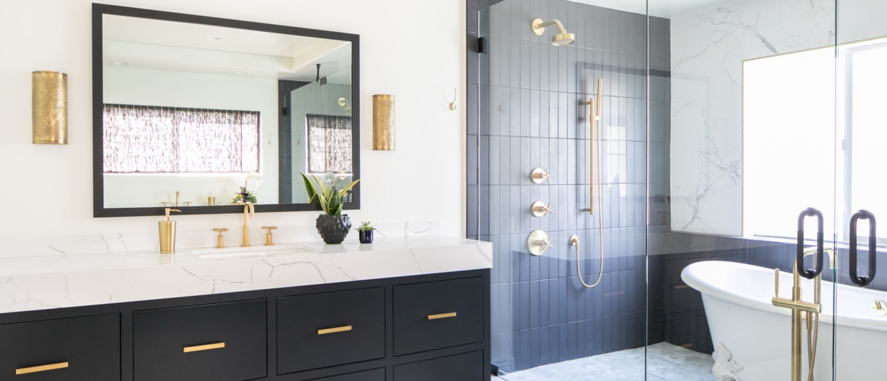
If you want a particular space to feel serene, like a main bathroom, consider using white towels and decanting everyday use products (like shower gels and hand soaps) into uniform glass bottles in earthy hues. I even suggest sticking with materials like tile or stone in more neutral shades like black, white and gray. With all these measures in place, you’ll feel like you had a mini-vacation each time you spend extended time there.
Calm Colors are Classic
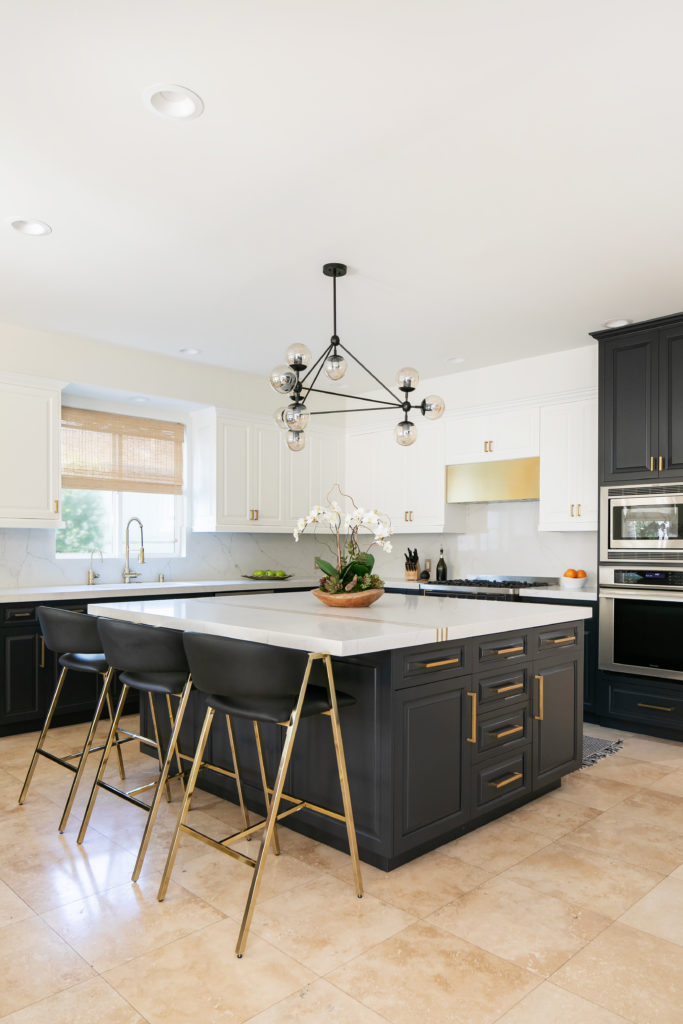
Perhaps one of the biggest advantages of a neutral color palette is the longevity it lends to the design of a space. I’m always being asked to give my advice on the current and future trends in design. There is always some new, hot, in-vogue feature to clamor about, and that’s exciting. But, homeowners may not always want to change the look of their spaces with every season’s fad. Neutrals don’t go in and out of style. They have a timeless quality that I love. A tuxedo kitchen featuring darker lower surfaces and lighter uppers, a lush white duvet, or stunning white stone with gray veining each have a classic look that will stand the test of time. That means you can invest more in these elements with the security that they will likely outlast trendier choices.
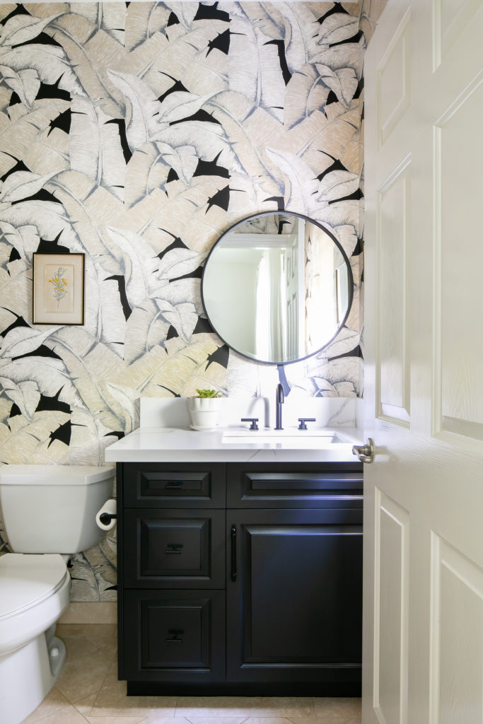
A neutral color palette doesn’t mean that every item in your space has to be white or black. It means that you begin with a foundation that won’t limit you to a particular collection of colors or styles. A base that doesn’t compete with supporting pieces grants you infinite design opportunities. Adopting a neutral color palette makes the world your oyster. Give it a try in a room of yours today!


replies (0)