Conversations about money are often cited as some of the most uncomfortable to have. But they don’t have to be. I don’t want to raise sons who are ignorant of money matters or intimidated by them. I want my boys to have an appreciation for money, a strong work ethic to make it, and the wisdom to grow it. Most of all, I want them to have a life free of financial bondage. I prioritize financial literacy for kids because financial freedom is something everyone deserves, but not everyone has. I’ll tell you more in today’s blog.

It Starts at Home
Most of you know me as an interior designer, but the truth is I’ve been an entrepreneur for far longer than almost anything else. I realized I owe much of my success to my ability to grow money and build wealth. But I wasn’t born with those skills; I was taught them. A great deal of what I know about money came from my father, who was and still is a skilled investor. While my dad’s financial lessons for me as a young girl surpassed what I saw my peers learning, we all look back and believe we could have been doing more. Dad taught me a lot, but I’m very honest about coming from a place of privilege where I didn’t ever want for anything. I did, however, work for the money earned from modeling and auditions. More on that later. Money and its impacts were introduced to me early in life. I’m passing on that wisdom to my boys.
Why Money Matters
In today’s society we talk a lot about money. The discussions are usually around what you can buy with it, what you can achieve with it, and how it impacts your status. Those things absolutely carry weight, but they weren’t the basis for the financial education for my boys.

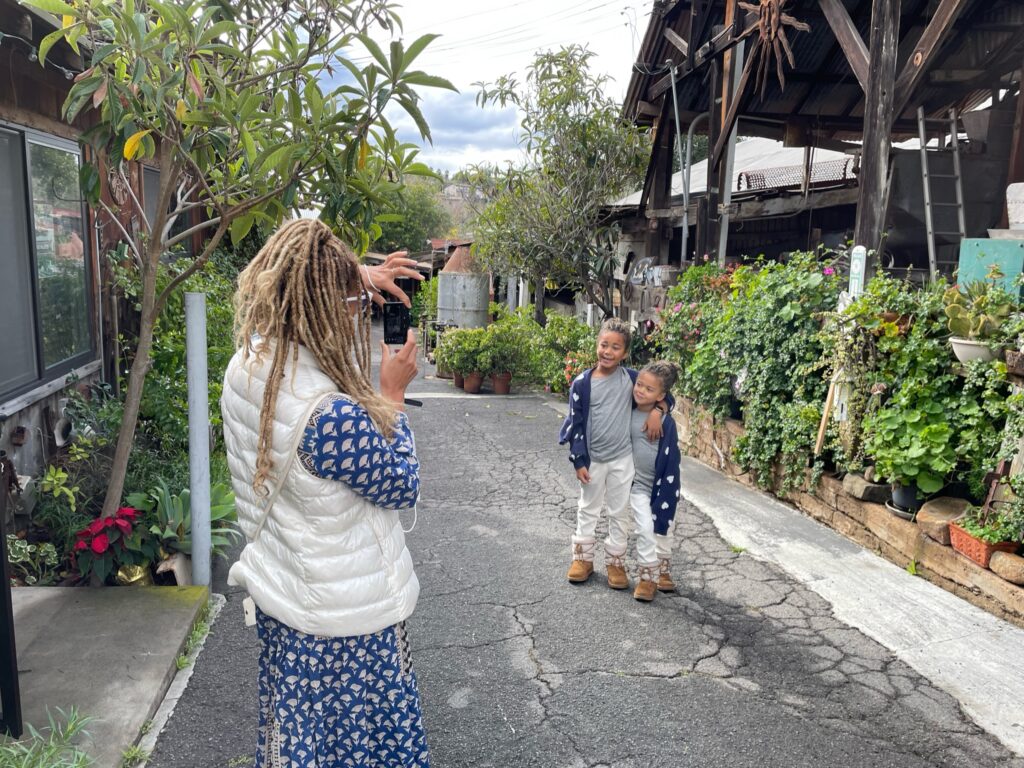
My boys come from a divorced household. As many parents in my position understand, that means our kids often receive multiple messages about money habits. They know mom’s approach, and they also know dad’s. I wanted my boys to develop their own relationship with money. I also wanted to be intentional about the lessons. Kids are getting messaging whether you want them to or not. They are inundated with images and themes around “rizz” and cars and bling. They are also absorbing our ideas and habits around money. It’s all there and you can’t avoid it.What we can do, however, is empower them with knowledge and strategy. That’s what financial literacy does.
Financial Freedom as a Goal
Jim Carrey once said, “I think everybody should get rich and famous and have everything they ever dreamed of so they can see that that’s not the answer.”
I think that perfectly encapsulates why I believe financial literacy is so important. Money can absolutely make life easier. It is necessary for so many of our basic needs. But money isn’t the end all be all. Financial freedom is! Right now my kids are at the ages where their innocence and naivety around purchasing power is understandable. Requests like “Mom can we get a boat?” aren’t a result of them being spoiled, rather it’s more about the lack of financial literacy. It’s always been crucial for me that my boys see their mom working hard. Now, I realize they also need to connect the hard work to results.
Kingsley and Kensi might grow up and be in a position to buy a boat, or a nice home. Maybe they’ll be CEOs of major companies, who knows. That isn’t what I’m after. I don’t care if my sons choose to live extravagantly or lead simple, humble lives. I just want them to be able to make the choice, and be comfortable. Financial freedom is about having the ability to make your own choices with how you use and spend your money. That begins with knowing how to make and grow it.
Lessons in Financial Literacy
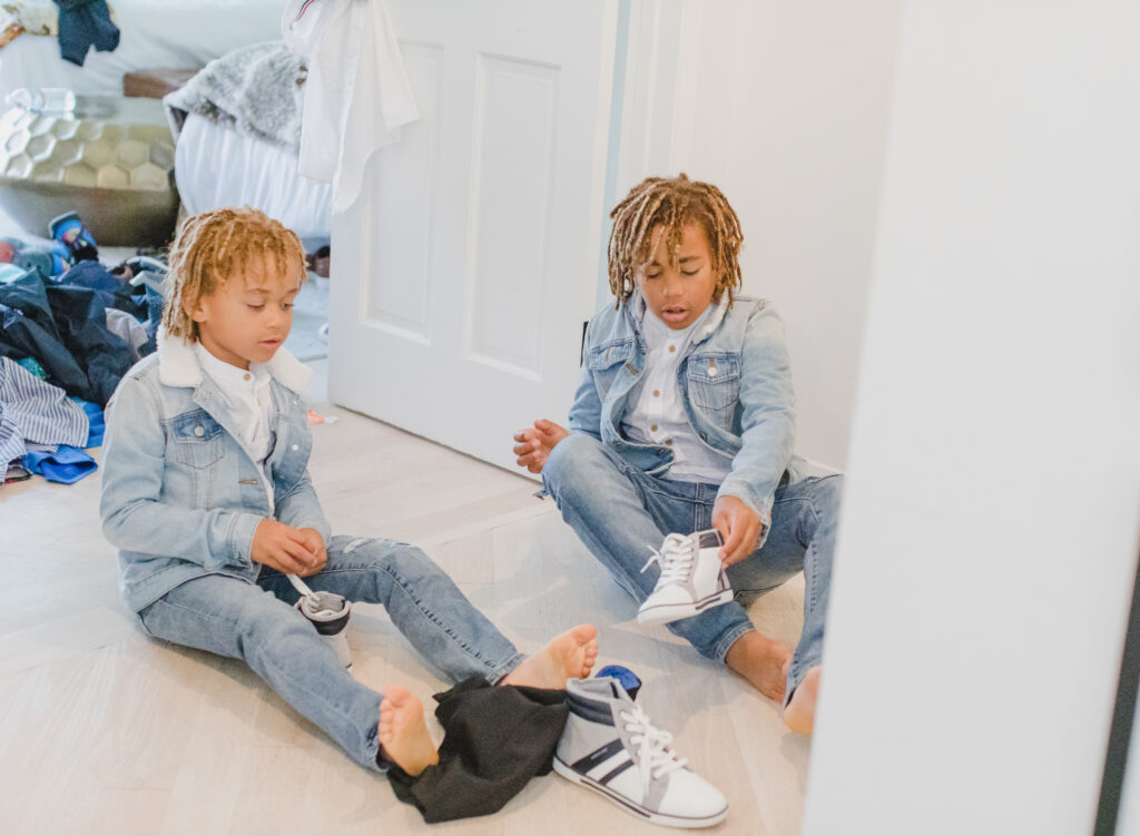
I have been quite thoughtful and deliberate when it comes to incorporating financial literacy into both life lessons and my sons’ curriculum. I don’t want money to feel intimidating or foreign to them, so we make it practical. One of the first things I did was take my boys to the bank, piggy banks in tow. We set up bank accounts at Chase Bank for each of them. Now, I could have done this without them, but I wanted them to see the process and understand what an actual “bank” is. This is money they save and don’t touch. Of course, being so young still, all of their needs are taken care of, so that part is fairly easy. But the concept of saving is something they can learn even now.
A Financial Advisor
One of the most helpful things I’ve done with the boys is hire a financial advisor who works for and with individual families in investing. I wanted someone willing to have conversations with them about financial literacy as a part of their tutoring schedule. She uses finance games to teach them about banking, stocks and even helps them develop fictitious business plans. If you’re able to take advantage of an advisor in this way, I highly recommend it.

Greenlight
Another tool of ours is the Greenlight app. It’s an all-in-one money app for families that allows kids to have their own debit cards, but in a way that parents can control. They are pre-loaded upfront, so there’s never a worry about running up a bill. My favorite feature is the “earn” element. I can list chores or jobs the kids can do in order to earn money. I get an alert each time something is accomplished, and the money goes into their account! It’s an excellent way to teach the value of work while also incentivizing them to do their chores.
![]()
Robinhood
Investing is a skill that even many adults don’t have. Robinhood is an app that makes it easy. Now, this one you have to be 18 to use, so I let my boys use my account and only under my supervision. I gave them each $100 to invest however they wanted, and they have fun logging in to check each day. It’s been interesting to watch them make certain decisions together and others individually. They are learning how stocks work, and how to invest wisely, all before their teenage years!
There are so many tools available to help kids become financially wise. We just have to prioritize it and be willing to help them understand it all. Sometimes simply buying your child a wallet and making him or her responsible for keeping up with the money inside is enough to get the ball rolling. Remember, while we need money for this life, financial freedom is what truly determines the quality of the life you live. That’s the lesson I hope my boys get as they learn more about how money is made. Check out these tools for your family!