I designed Breegan Jane fabrics and Breegan Jane wallpapers with the understanding that there will never be a one-size-fits-all for interior design. After all, we style homes based on the individuals who live in them, so of course they’re all going to be totally different. If you know anything about me as a designer, you know I believe a home should be customized for the way you live and the way you desire to feel each time you walk into it. A significant part of that has to do with the colors you choose for your spaces. Now, big, bold colors are certainly having a moment right now, and I love that. But bold isn’t for everyone. So if neutrals still have you in a chokehold, this blog is for you! Neutrals will always be my first love in interior spaces. I’m on a mission to prove that done well, they’re absolutely stunning. Let’s talk about a few ways of incorporating them in the home.
Neutrals: From Stale to Stimulating
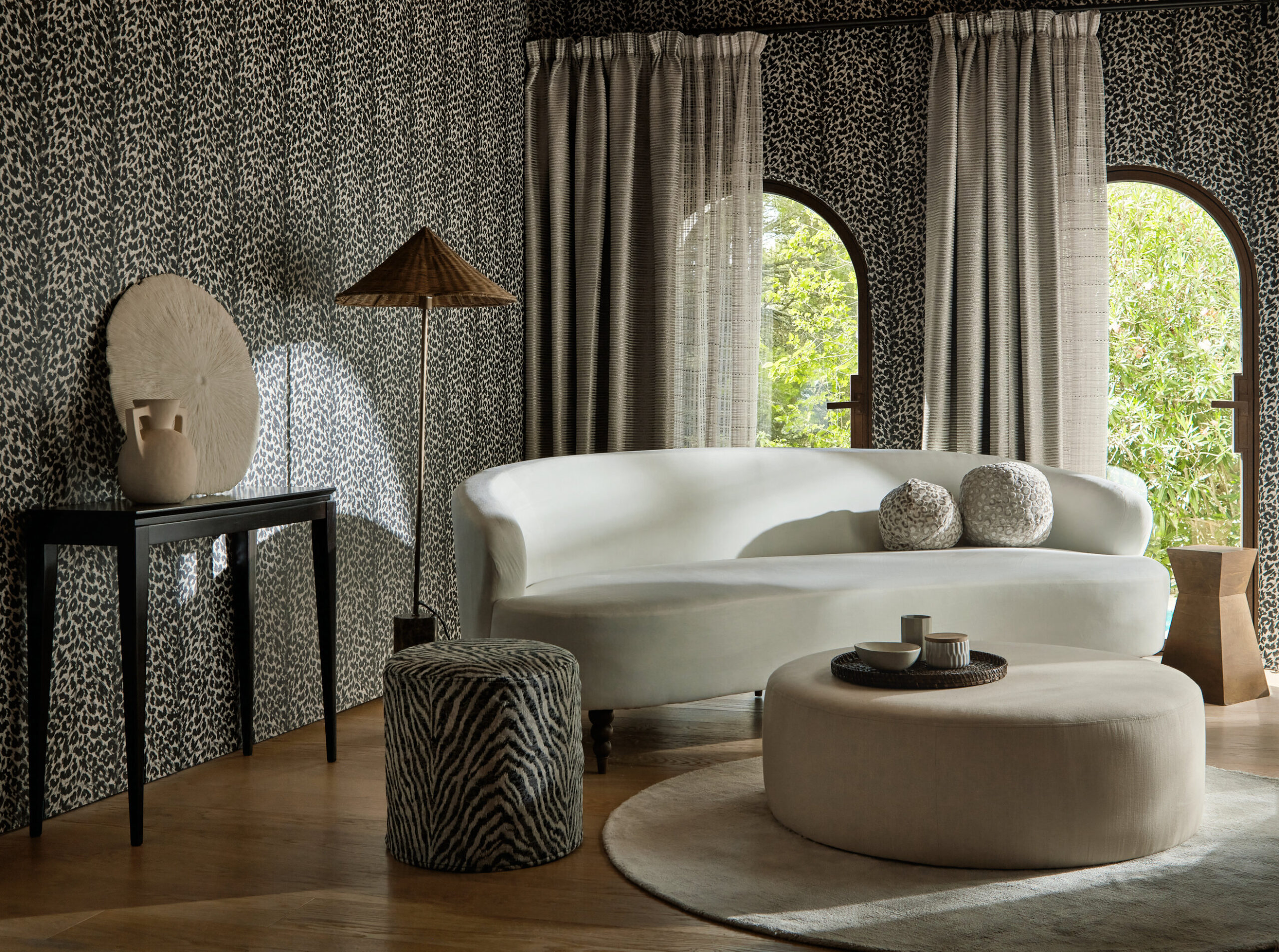
When I talk about neutrals, most people immediately think of spaces swathed in beige and white. Now, those are definitely neutral shades, but there are so many more colors that fall within this category. You do your spaces an injustice if you limit yourself in that way. Neutrals fall anywhere from the whites and off-whites to grays, browns, blacks and anything in between. They are often favorites used by designers because of their versatility. Incorporating any other color or style becomes infinitely more easy when the backdrop is neutral. But neutrals without a strategy or curated design plan can feel more dull than delightful. If you’re in search of a space that still feels intriguing and intentional, using neutrals in specific and thoughtful ways is crucial.

Don’t Forget About Texture!
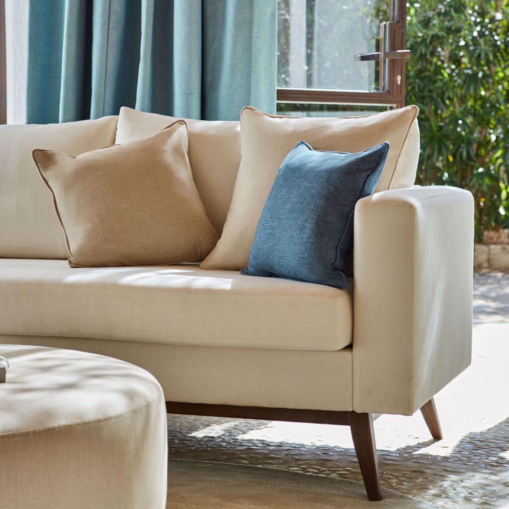
I find that people often consider color above all else when they’re designing a space. That’s an important factor for sure, but it isn’t the only one. If you’re using a neutral color palette, one of the best ways to keep it interesting and catch the eye is by infusing the space with texture! I love the way textured neutrals make a room feel instantly more luxe. You can always do this with natural elements like stone or woods because those typically come in organically neutral tones. If you’re looking to introduce neutrals on a larger scale, consider fabrics!
My Clarke & Clarke line is designed to suit every taste and palette. I wanted everyone to be able to find the perfect finishing touches for their rooms. With that in mind, one of my preferred ways to work with neutrals is to add textured fabrics into a space. You get the color you’re looking for but with so much more dimension! Textures can look differently as light bounces off of them, and they always draw guests’ attention.
Paradiso Fabric
Paradiso is an organic Breegan Jane fabric perfectly suited for upholstery, cushions and curtains. It comes in several neutral colors like oatmeal, ash, buff and more. Paradiso is a collection of 26 tonal woven plains. I was inspired by so many coastal elements, so the colors feel rich and relaxed. You’ll notice these fabrics feel distressed for a deeper connection to nature. The texture gives them a uniquely aged look that feels as elegant or casual as your space requires. I love Paradiso for chairs and pillows!

Serengeti Fabric
If you’re in search of a textured neutral fabric that still incorporates a pattern, Serengeti is ideal. It comes in four colorways, but Noir is the most neutral. Serengeti is a Breegan Jane fabric unlike any other fabric because it was designed on the horizontal scale with a flame stitch technique. The fabric has a ribbed definition, and as if that wasn’t enough, it also features a delicate foil texture printed on top. Serengeti is an eye-catcher!
Prints Can Be Neutral, Too!
I’m not sure who started the myth that neutrals can only be solids, but we’re debunking that today! When “color shy” clients come to me wanting to incorporate a bit of interest without bolder colors, I often steer them in the direction of prints and patterns in the colors they are familiar with. It gives them a refreshed look without going too far outside of their comfort zones.

Manda Wallpaper
I talked about using animal print in design before, and Manda is the perfect example of how to do it with neutrals! Manda is a Breegan Jane wallpaper that comes in three shades, and all of them are neutral! The paper features a classic zebra pattern in a textured jacquard. Manda was meant for accents! If you want to spice up your sofa, add a funky accent chair or even hang curtains in an otherwise solid room, Manda is what you need.
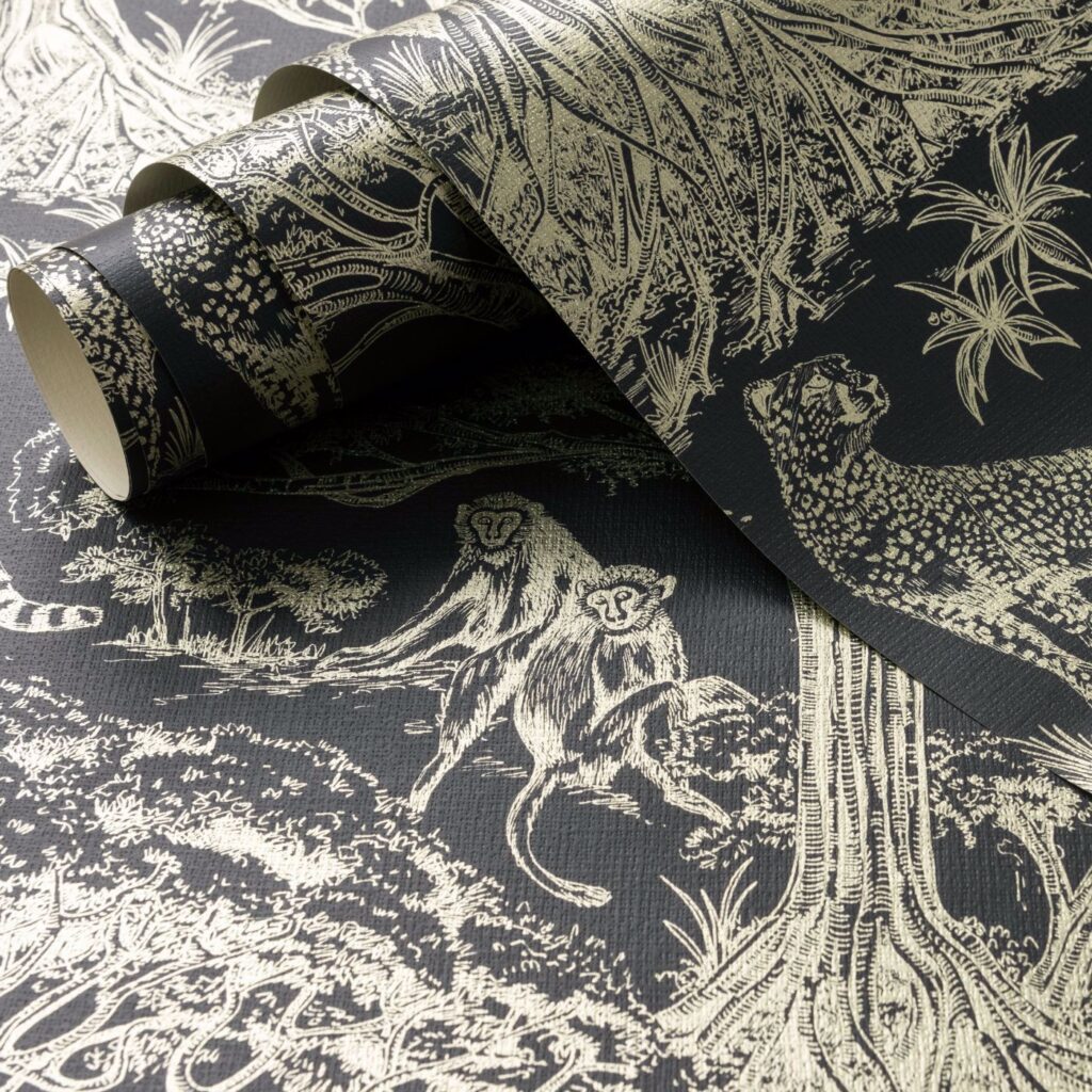
Kisumu Fabric and Wallpaper
Kisumu is offered as both a Breegan Jane fabric and a Breegan Jane wallpaper! Kisumu is a hand-drawn African toile that depicts the iconic “Tree of Life”, the Baobab tree. It’s definitely one of the more immersive papers and fabrics. I love it, because you don’t usually think of toile when you hear “neutral”, but so many of the colorways are! Kisumu makes a statement in any room, effortlessly. It’s a conversation starter and a show-stealer in the very best way. This print can be layered in a space with other prints or left to stand on its own.
If color isn’t your vibe, lean into neutrals in a new and fresh way this season. Trust me, we are reimagining neutrals, both solids and prints, with audacity. Check out the links above to find fabrics and wallpapers that are much more daring than they are demure. Your spaces will thank you!


replies (0)