I’m often asked how I can look at a “blank canvas” property and envision everything from furniture layout, to paint colors and even bathroom and kitchen fixtures. The answer, for me at least, is simple. My mind just works differently. My job as an interior designer is to discover the features that will coalesce into one cohesive display. But that doesn’t always mean selecting items that are similar. In fact, contrasting elements in interior design can often make for the very best styling! Curious? I’ll tell you more.
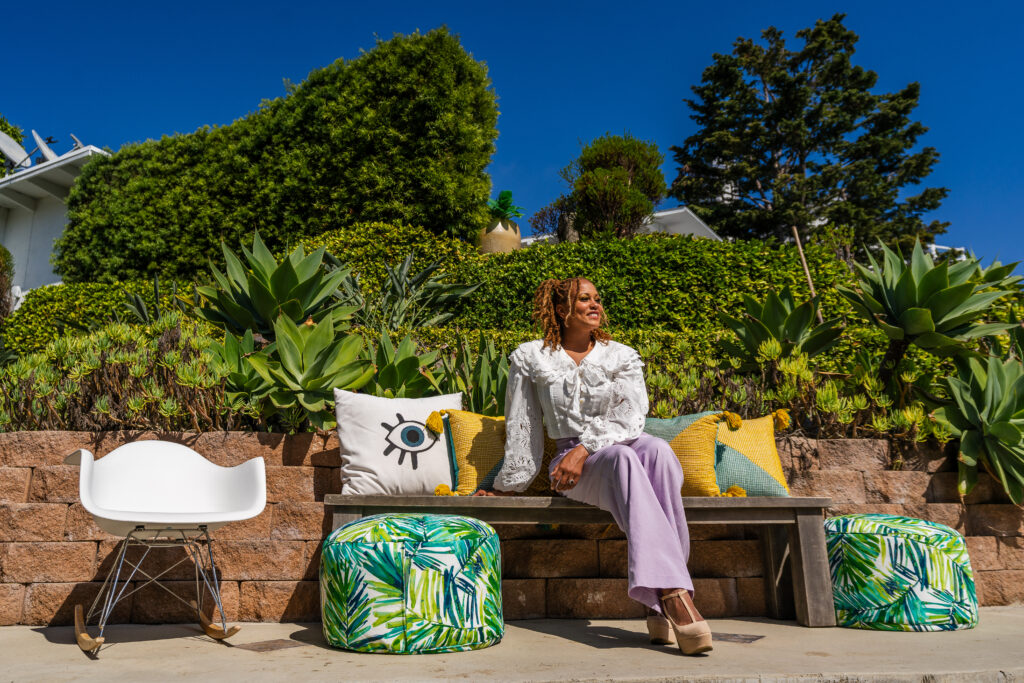
Opposites Attract?
It can be tough to believe that contrasting elements work well in design. I get it. For so many years the industry has sold us all the idea that everything must match. Think about it; when you go into big box furniture stores, everything comes in a matching set. You can get a bed, nightstands and dresser all with the same material, color and embellishment. When clients choose hardware for their rooms, they typically go with all one metal: brass, chrome, black, etc. We have simply been conditioned to believe things need to echo one another in order to feel connected. It’s not true! Opposites might not attract, but they certainly do complement! Adding contrasting elements in your interior design gives your spaces a chance to feel dynamic and layered. That’s what you want when you’re creating a curated home.
Organic Versus Luxe
So, now that we realize we can vary the styles of our decor without worries of everything clashing, how do we effectively mix and match? Well, I aim for balance. For instance, I am in the process of designing my new beach home in Southern California, and I’m hand-picking every single thing. I decided on Venetian plaster for several of my walls. Limestone on walls instantly gives a very earthy feel to a space, and while you might be inclined to make that the theme of the entire room, I’ve decided to juxtapose the sort of organic appearance of Venetian plaster with an oversized and elegant chandelier!
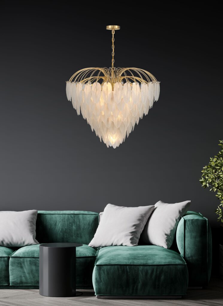
The two seem like worlds apart, but while the chandelier alone might feel over-the-top, combined with a more muted background, it sings! If you’re wanting to bring a bit of these contrasting elements to a room in your home, consider the places where you can add something ornate to a more subdued surrounding. The balance makes for a stunning view!
Edgy Versus Classic
When I told people I planned on combining graffiti with wainscotting, I definitely received a few shocked looks. I get it. I mean, graffiti has always been a more rugged form of artistic expression, while it just doesn’t get any more timeless than wainscotting. I wanted to give my son a say in the design of his space, but mama knows best when it comes to the lasting power and the aesthetics of design. These two contrasting elements are a surprisingly chic combination that I’m already loving! I recommend an edgy and classic blend especially when it comes to a couple that has differing opinions on what they want for a space. You can avoid several arguments by being willing to find elements that appeal to him and her, then mix them in attractive ways. Don’t be afraid to combine softer elements with more severe ones. The result is often a delightful and interesting one that will catch the eye and feel bespoke!
Solids Versus Patterns
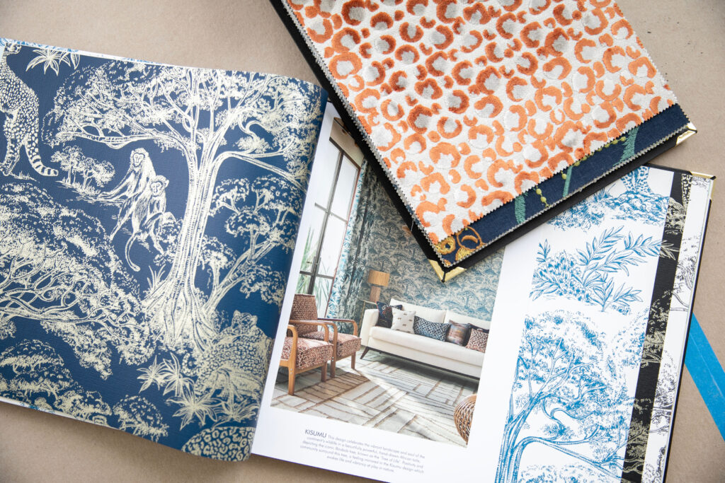
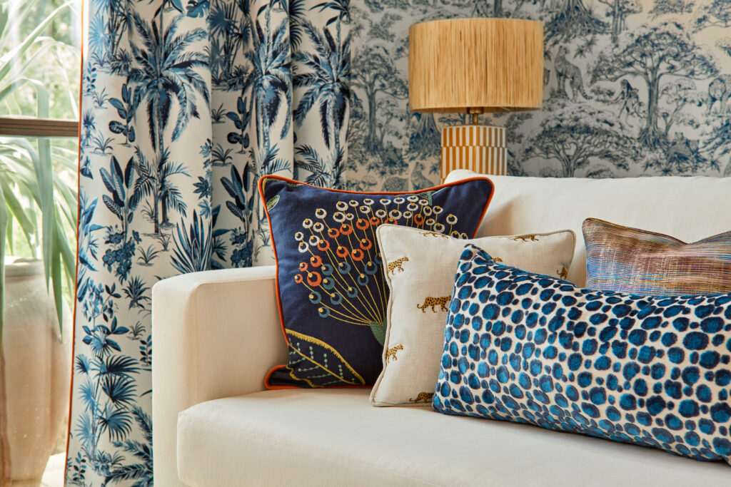
This one is a favorite of mine, because it can be done in a myriad of ways. If there’s one thing you should consider, it’s layering color and patterns together! I recently created my Breegan Jane fabrics and wallpapers line with Clarke & Clarke, and it is brimming with prints and hues that remind me of some of my favorite places. There are so many options that you can mix and match for a tailored look.
Want to add a wow factor to your space? Select a beautiful wallcovering, then add gorgeous throw pillows to your couch to bring out the colors in the wallcovering. Weave in patterns that are different but feature similar colorways. Treat your rooms like outfits. Add accessories to your foundational design for the look that only you could create!
I talk a lot about personalized and customized interior design because I believe your home should look and feel like those who live there. Incorporating contrasting elements is one excellent way to achieve that in unique ways! Use these tips to give your home an extra special touch. You won’t regret it!


replies (0)