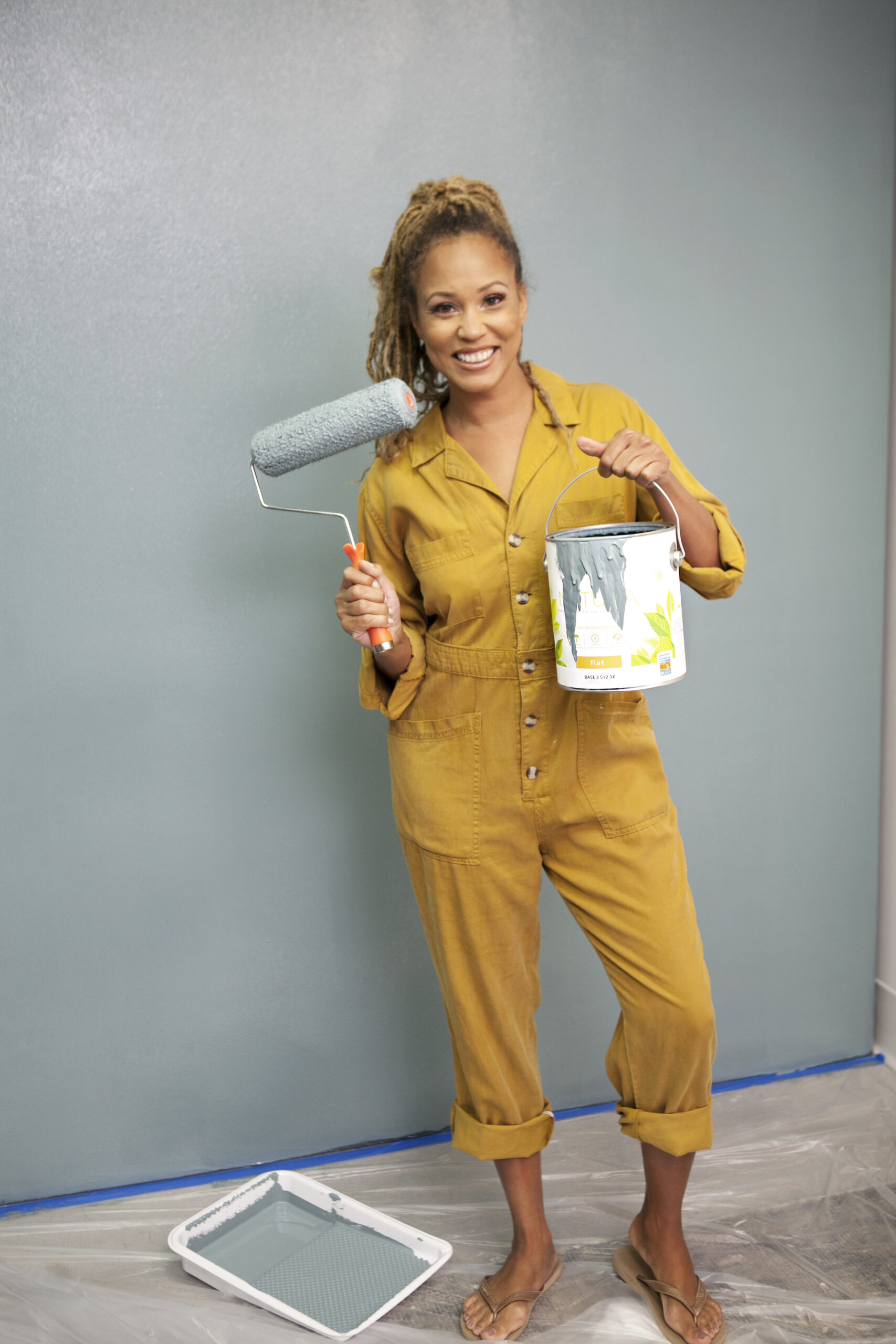
Interior designers have a way of making various elements of home design work to create moods and evoke emotions throughout the home. But that has to be done with consistency. How do we do that? Well, each designer’s strategy is different, but one of the ways I create that consistency is with neutral paint colors. Here’s why.
The Power of Neutral Paint Colors
When it comes to making statements with color in interior design, bright and bold colors certainly have “stand-out” factors. Something vibrant and flamboyant may definitely get seen. However, using that colorway throughout your home may present as a little more maximalist than you ultimately want.
Neutral colors, on the other hand, are much more calming and inviting to the naked eye. That’s because they have less variation from one to the other, generally speaking, so you can more easily move from neutral to neutral without interruption. The seamless transition also helps with coordination and more cohesion in a space. What’s more, using neutrals as your base palette in your room design will create a space that is easier to maintain AND coordinate with non-neutral colors. These are just a few reasons why neutral paint colors are my go-to in my design projects.
Wonderfully White
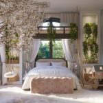
I learned early on in my career that white isn’t just white. So many different shades add to or detract from the inviting vibe of a space, and I found it essential to hone in on which white shades were the best. I ended up choosing a shade of white that works well in practically all of my interior projects that require white tones. In my book, there’s no better white than “Cool December” by Dunn-Edwards. I’ve been using it in my design projects for over 10 years.
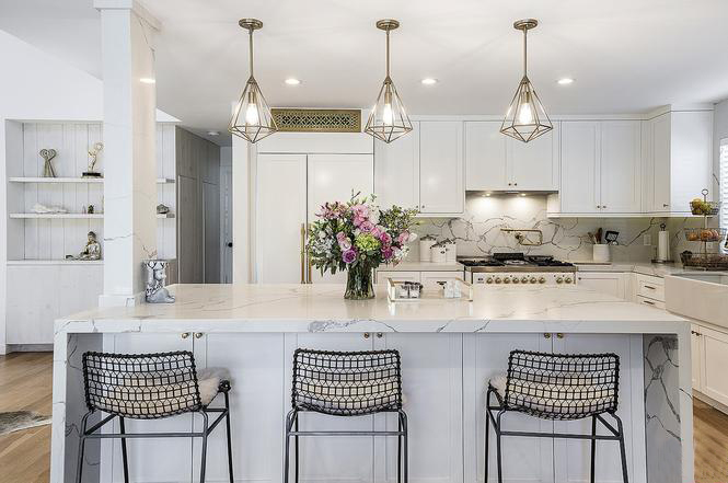
“Cool December” has a much cooler tone than many other white shades, yet it doesn’t feel clinical or hospital-esque, if that makes sense. Rather, it’s a crisp, clean tone that is extremely tempered with respect to brightness. It’s great for any area of the home, but I love it in rooms that get used frequently simply because it’s touch-up friendly. Magic erasers work well with this shade, and that’s great for homes with active toddlers.
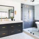
Black is Beautiful
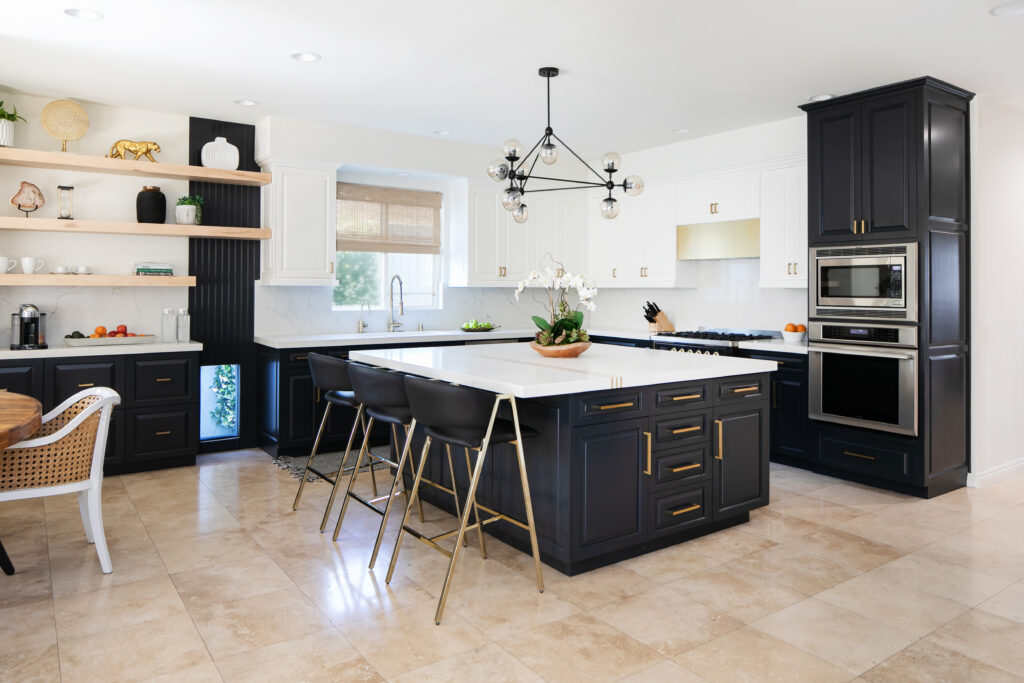
As with all colors, selecting the perfect shade is always key in design projects. When I want a darkened space and dramatic impact, I reach for Behr’s “Little Black Dress.” Most people don’t even think about black as a neutral paint color, but it actually is. In fact, it’s a bold neutral I think should be considered more often in home design. I consider this a more versatile version of black because of the hints of navy undertones layered within. That adds a bit of warmth and gives the color depth when used on walls and cabinetry. The slight hint of blue also adds personality and brings a more inviting aesthetic that more stark shades of black don’t present. “Little Black Dress” is a favorite for creating timeless looks, such as tuxedo kitchens.
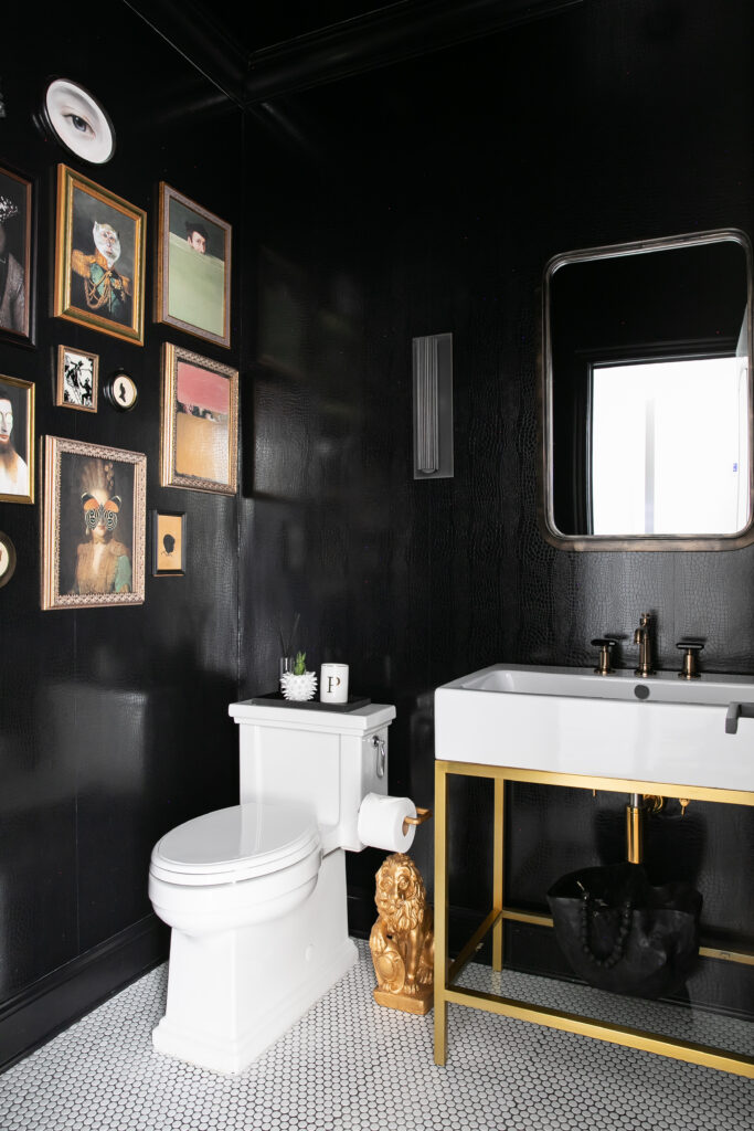
Now, when I need an absolute black, there’s nothing that works like “Tricorn Black” by Sherwin-Williams. Tricorn Black has a light reflectance value (LRV) of 3, which means it virtually absorbs ALL light with which it comes in contact. At the same time, the lighting in the space can make it look a bit lighter or darker. I mention that to say it is a solid choice for an all-around black neutral paint color, but it can be flexible depending on natural light options where you may use it. And, because it has no undertones, you can pair it with many other colors that do!
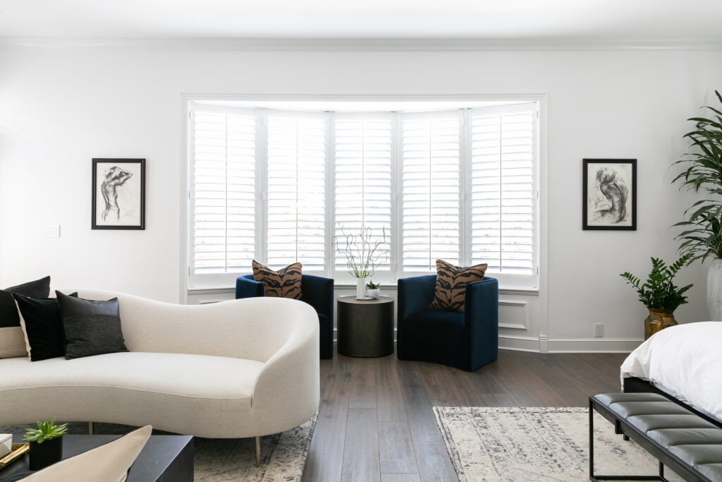
Going Greige
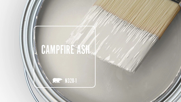
If you’re looking for a neutral paint color between black and white, I have a perfect choice. It’s a mix of gray and beige, or “greige.” The combination has the visual flexibility to look “gray” without being as cold. Beige adds the warmth needed to give the shade a unique dimension and appearance. If you’re curious about what it looks like, I love Behr’s “Campfire Ash”.
The awesome thing about greige is that it’s a muted neutral that evokes calm and serenity. It not only works well as a neutral paint color for walls, but it is also amazing for furniture and wood stains if you don’t prefer dark tones in your decor. What’s more, it allows designers to bring inside the shades and tones from outside hardscapes. Greige can make an impact in any room in the home, but I think it works exceptionally well in living rooms and dining rooms. It also complements natural stone elements in the kitchen area wonderfully.

Your Favorite Neutral Paint Color?
These are a few of my favorite colors I use when selecting neutrals as a foundational color palette, but I’m curious about what colors you prefer. Let me know in the comments. If you’re curious about what neutral paint color would look best in your home, I can definitely help guide you! Contact me at The Expert, and let’s look at your space together to see what would make your gorgeous home look even more magnificent!
replies (0)