I can’t tell you how thrilled I am to be doing my eighth show with the HGTV and Food Network family! We’ve tackled everything from building houses for deserving families on Extreme Makeover: Home Edition, to judging sweet confectionery designs on Holiday Baking Championship: Gingerbread Showdown! Now on Bake or Break, Stephanie Boswell is helping struggling bakeries regain their stride with her incredible pastry chef expertise, and I’m redesigning the spaces to maximize and complement all the retail success they’re after! It’s a show with a lot of heart, beautiful design and delicious desserts! Let’s explore the power of the visual demonstrated throughout the episodes!
The Cookie Jar is Born
The first Food Network episode of Bake or Break took us to Flint, Michigan. There, we met Teressa Morris, the owner of The Cookie Jar. Teressa went into business for herself after leaving her job in the auto business when that industry took a hit a few years ago. She hadn’t considered a career in baking until her son took the five-inch cookies she made to a local barbershop and they sold out within an hour. The sweet treat named the “Million Dollar Cookie” was an undeniable hit, and soon after so would be the case with her bakery, The Cookie Jar. Unfortunately, Teressa’s business has had trouble hitting its financial goals recently. She was worried that she would need to close the store if things didn’t turn around soon. That’s where Stephanie and I came in!
Creative Use of Color in Design
If you’ve followed along on my Instagram and blog, you know I talk about color therapy from time to time. That’s because color holds so much power! Color has the ability to affect our mood, the way other hues and lighting show up in the space, the length of time we spend in a place, and sometimes even purchasing power! Sound strange? Consider the places you typically associate with relaxation. What colors do you usually see in spas? What about vacation resort brochures? It’s usually the blues, whites and creamy neutrals that abound. That’s because when used well, these tones can feel soothing and serene. I’ve talked at length about my love affair with the color teal. It always has a way of reminding me of my favorite place on earth: Ibiza. Color can evoke the mood you desire in a space or bring up memories and feelings.
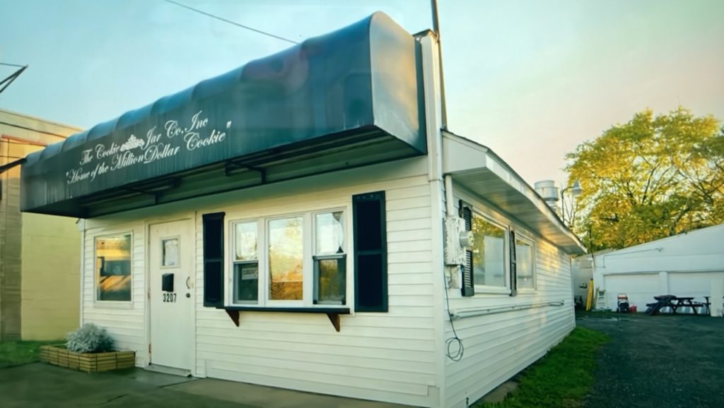
When I’m designing, color is always carefully considered because of the power it holds. When Food Network expert Stephanie Boswell visited The Cookie Jar for the first time, she drove past it several times before actually finding the building! A lot of that was because the building blends right into its surroundings. The Cookie Jar featured a pretty no-frills black and white design on the exterior. Even the sign failed to stand out. Immediately I knew we needed to give the exterior a facelift that would be more than simply aesthetically pleasing. I wanted the building to be eye-catching and fascinating. We want to drive traffic and potential customers to the right place, after all!
Choosing the Right Paint Colors
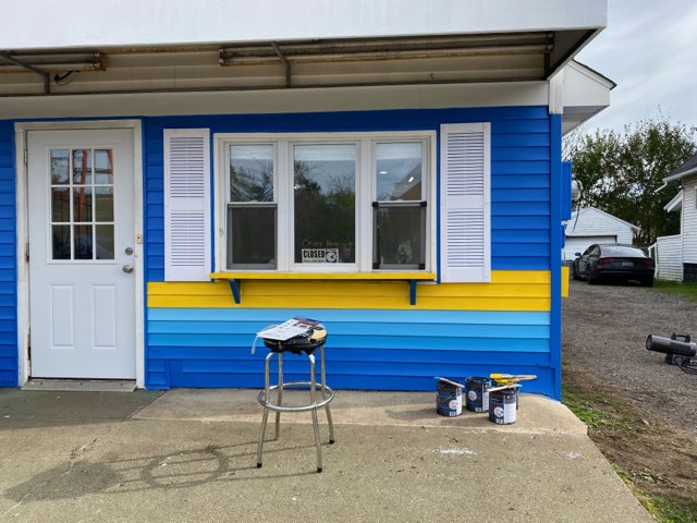
Teressa wasn’t the biggest fan of color at first, but when we discovered she loved blue, I set out to find that perfect shade! With the challenge of colder temperatures and rainy weather, we solidified plans to cover the building in a vibrant blue with a bright yellow stripe. Since parking was a bit of a mystery to anyone looking to buy Teressa’s Million Dollar Cookies, I used arrows (also yellow) as a bit of decoration to direct customers to where they could park. It was the perfect fusion of form and function, and it worked out well! Now, anyone driving by can immediately spot The Cookie Jar, and I’m certain Teressa will gain new patrons because of it!
Interior Design as a Branding Tool
It’s true, we interior designers love to make things beautiful. Design relies on the visual to influence the way we experience a space. But, in retail, design can also do the heavy lifting of branding and advertising. I recently designed Anne Sisteron’s flagship jewelry store in Beverly Hills, California. We commissioned custom, hand-painted wallpaper featuring the owner’s favorite color (chartreuse) to adorn the walls in the store. The paper will also be used in packaging and artwork around the space. It’s become a bit of a signature for the store because of the easily recognizable print and colorway. That’s what great design can do!
Inside The Cookie Jar, I noticed there wasn’t a single actual cookie jar in sight! Ironic, considering the name. I also noticed attention to the look and décor was lacking. When you want people to feel comfortable in a space, you have to create ambiance. I wanted Teressa’s bakery to stimulate the kind of warm feelings you get when you walk into your mom’s house with cookies baking in the oven. We achieved that by setting up a space that felt more like a living room than a warehouse. I also wanted to make the connection to the name of the bakery. I used several cookie jars in different sizes and arranged them on cool shelving. This addition made the space look like a showroom for all of Teressa’s beautiful and delectable sweets. You can’t buy what you can’t see! Now, everyone who walks in will be tempted to purchase something!
Configuration Counts in Retail Design
Before the makeover, there was a huge ice cream case occupying a great deal of real estate right as you entered the bakery. While Teressa’s customers have been known to frequent her store in the summer for a scoop, this cumbersome appliance was definitely blocking valuable space that could be used in other ways, and I was determined to fix that. Whether I’m refreshing a room or designing from scratch, I always ask myself how the space will be used. In this case, the question posed was, “do you want people to come and stay for a while, or buy and leave?”
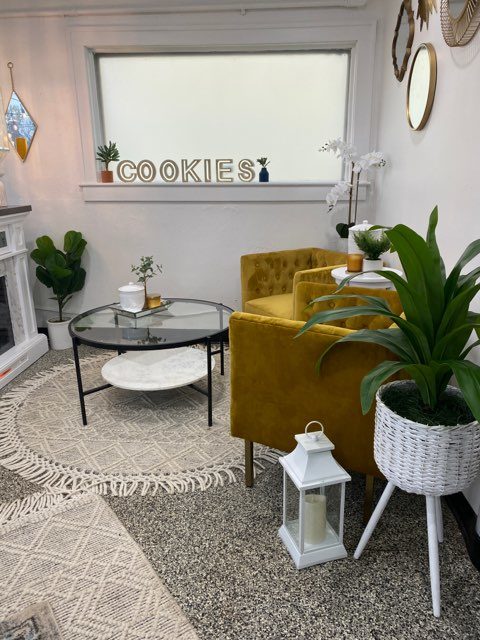
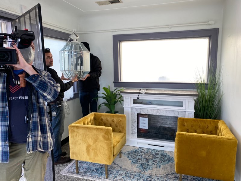
Teressa mentioned that she wished there was room for seating. So, we created a cozy nook at the front of the store with gorgeous golden chairs to match the exterior. I also added a fireplace and table. Now, guests have a dedicated place to sit and enjoy their treats when they visit. Additionally, there are cute little tables outside surrounded by yellow flowering plants! Seating is everything when you’re creating a useful space. The more comfortable and convenient you make it, the more likely your customers will want to hang around. And more time spent in a space means more dollars spent there, too!
Food Network: Bake or Break!
Food Network, you’ve done it again! Stephanie was able to give Teressa some great tips on new desserts (the trillion dollar truffles are so tasty!), a boost in her confidence, and even ideas to bring in more wholesale orders! I was able to upgrade the design in the space to a striking and prominent landmark that no one will ever miss again. I’m so sure The Cookie Jar will be around for quite some time! Did you watch? Share your thoughts with me in the comments.



replies (0)