Whether they’re on the hunt for a new space or attempting to update their current one, my clients often have one thing in common. They want to know how to make their space appear larger. Our homes are our safe havens. We spend so much time in them, and no one wants to feel cramped. Unless you’re up for serious renovations, you really have to get clever about making the most of your existing square footage. Luckily for you, I’ve spent a great deal of time helping others see the hidden potential in their homes and bringing out the best in them. I’m ready to share with you my interior design tips and tricks to getting a spacious abode!
Get Clever with Color
Let’s start with an easy one. Color matters, and not just in the way you might think. When people think of interior design, they usually go straight for the “pretty stuff.” They want to create mood boards filled with trendy chairs, pillows and lighting fixtures. Now, I won’t lie to you. I love all those details just as much as the next person. After all, it is what I do. But, it isn’t all that I do. My job is to ensure the choices we make together in a home will suit you and your family for years to come, and that means maximizing the usefulness of a space.
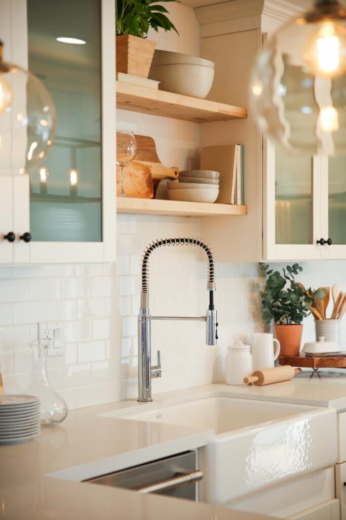
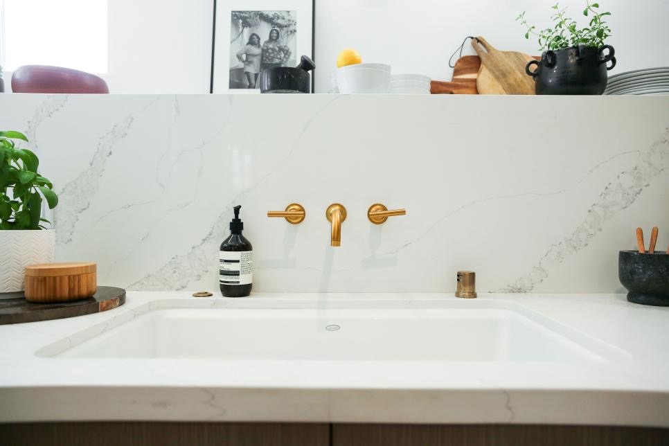
So, how do we do that with color? Well, for starters we select shades that are going to direct the eye exactly where we want it to go. Think about clothing. When people want to look slimmer, they tend to wear darker colors. Lighter hues, on the other hand, can sometimes make a person or part of a body appear bigger than it typically does. So, if we want to call attention to the expanse a room has, opting for brighter colors across the largest surfaces is the way to go! I love using stone in my designs. While it comes in a myriad of colors and patterns, white has to be my favorite for places like countertops and backsplashes. It makes a space feel airy. I love tuxedo kitchens for this reason as well. White uppers draw the eye up and make the entire room feel more open. Want your kitchen to feel sizable? One of my best interior design tips is to use white on the biggest surfaces. That includes your walls, by the way.
Fruitful Flooring
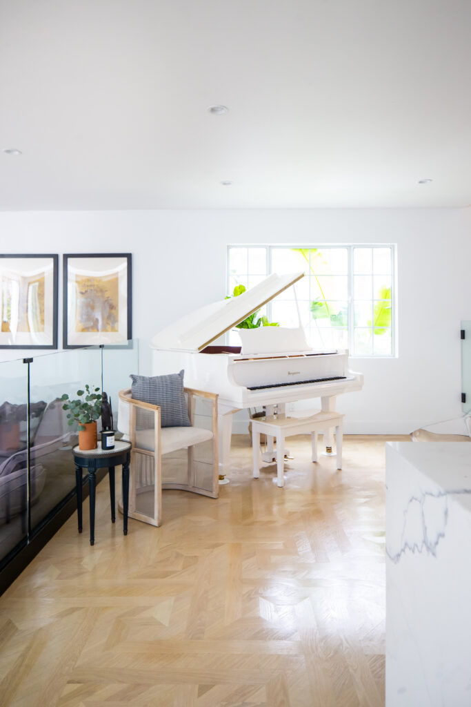
If you’ve seen my previous Venice Beach home, you probably know I’m a fan of parquet flooring. In fact, I created my own pattern and used it throughout my living area in that house. Parquet flooring is known for the stunning geometric shapes in wood flooring that truly give a room a luxurious feel. Besides the elegance of parquet flooring, I also love that it is nondirectional. Flooring might not be the first interior design element you think of when you want to make your space appear more generous, but I’m going to give you a great reason why it should!
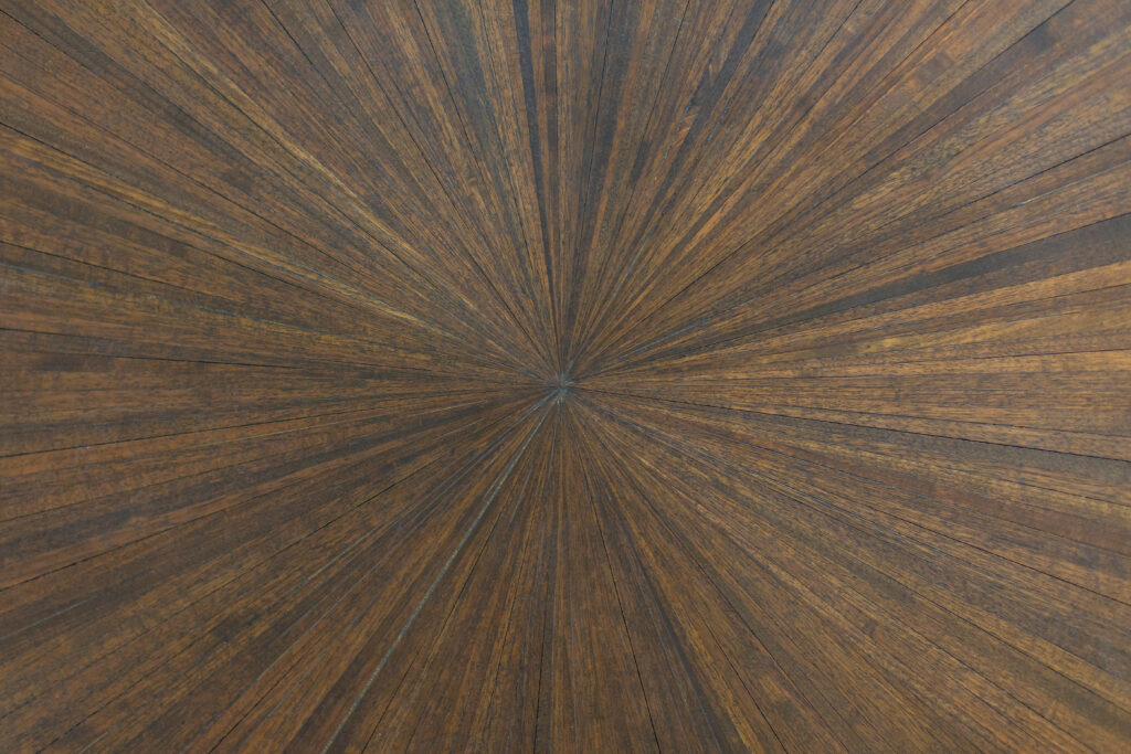
Many of the beach homes in Venice Beach, California are narrow with several levels stacked on top of one another. Though still ample, the rooms can look quite tapered. If you were to use a more traditional hardwood flooring design where each piece is placed in a row, you almost accentuate the slender appearance of each space. That’s the opposite of the goal we’re after when we want our rooms to look airy and extensive. So, consider nondirectional flooring when it’s time for an upgrade!
Don’t Forget About Windows
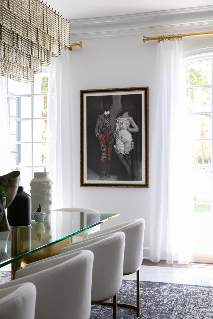
When it comes to Breegan Jane signature interior design tips, “high and wide” definitely ranks highly! That’s in reference to curtains, and it’s a principle I live by! How many times have you walked into a home and remarked about how much natural light it had? Probably more than you care to count. Well, that’s because windows can make or break a space. But, if windows are the cake, then window treatments are the icing! That’s because curtains cause our eyes to focus on the height of a room, which always has a big impact on how spacious it seems. So, let’s trick the eye! Your home might not have floor-to-ceiling windows, but nothing is stopping you from hanging those curtains at the ceiling anyways. Making the rookie mistake of placing your curtain rod right above shorter windows will dwarf the space. Do yourself a favor and aim for the stars (almost, at least, lol). You’ll feel like the space instantly opened up.
The Magic of Mirrors
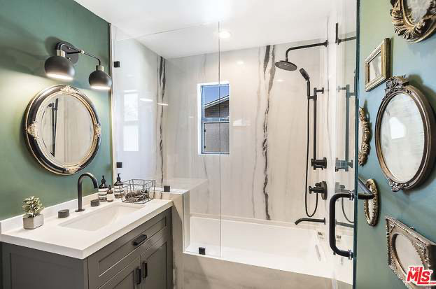
Listen, don’t we all wish we could begin a home remodeling project on a whim and somehow have it instantly and effortlessly finished within a few days? I’d love to be able to demolish walls anytime I want a bigger space, but living through renovation is not for the weak! Fortunately, there’s yet another (much easier) way to achieve that cavernous quality in your space. Mirrors have long been a staple for me because of their endless interior design uses! They make for gorgeous accent walls in bathrooms and living rooms.
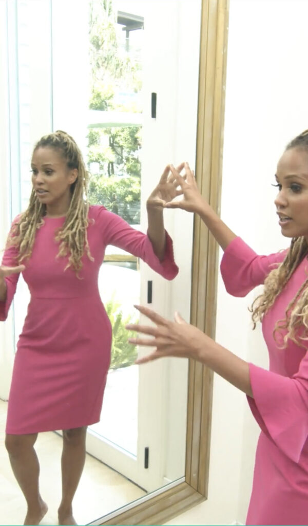
Their reflective nature comes in handy in other ways, also. They can cause a room to literally appear to be double its size! Don’t believe me? Check out the photo below. People often expect this room to be much bigger because this oversized mirror is working overtime to do exactly that! Here’s another little secret: This is actually a mirror sort of built into the wall with a border around it! No more worries of heavy mirrors falling and hurting anyone.
You don’t have to have a mega mansion to get the spacious home you desire. Sometimes, just a few changes here and there can make all the difference! If you’re looking for help with your home, I’d love to chat with you! My interior design tips and tricks are only a virtual consultation away! Schedule one on The Expert today!



replies (0)