Most potential home buyers know the feeling of looking for the perfect house with the perfect architecture and perfect appliances and furnishings. Homeowners and renters alike often feel discouraged when they struggle to achieve the same look in their homes as the perfect photo they saw on social media or on tv. But here’s the thing, folks…perfection doesn’t exist! There’s almost always something that has to be modified or built in order to get your real estate reality to match what’s in your dreams. The good news is, if you hire a designer, we are usually able to help you find clever workarounds and innovative solutions to get to your desired goal. If you’re looking to elevate your spaces, I’ll share a few easy swaps and interior design tricks to ensure you get what you want, every time!
Keep the Focus: Seamless Design
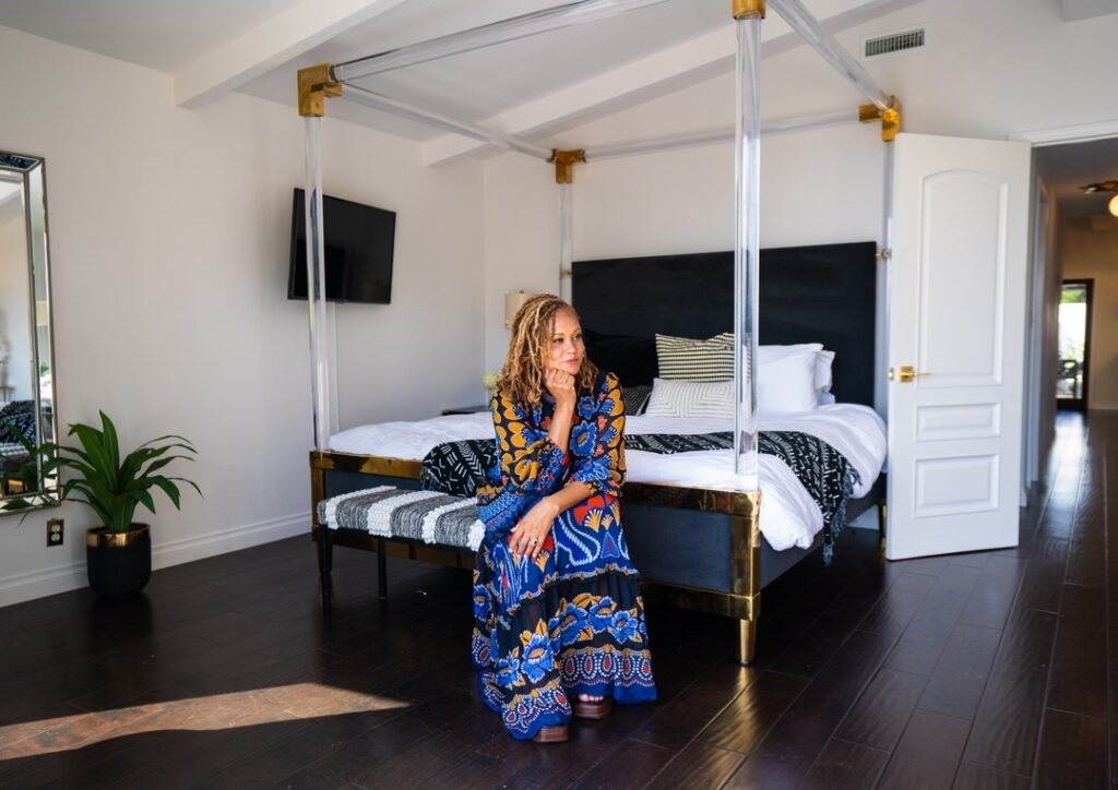
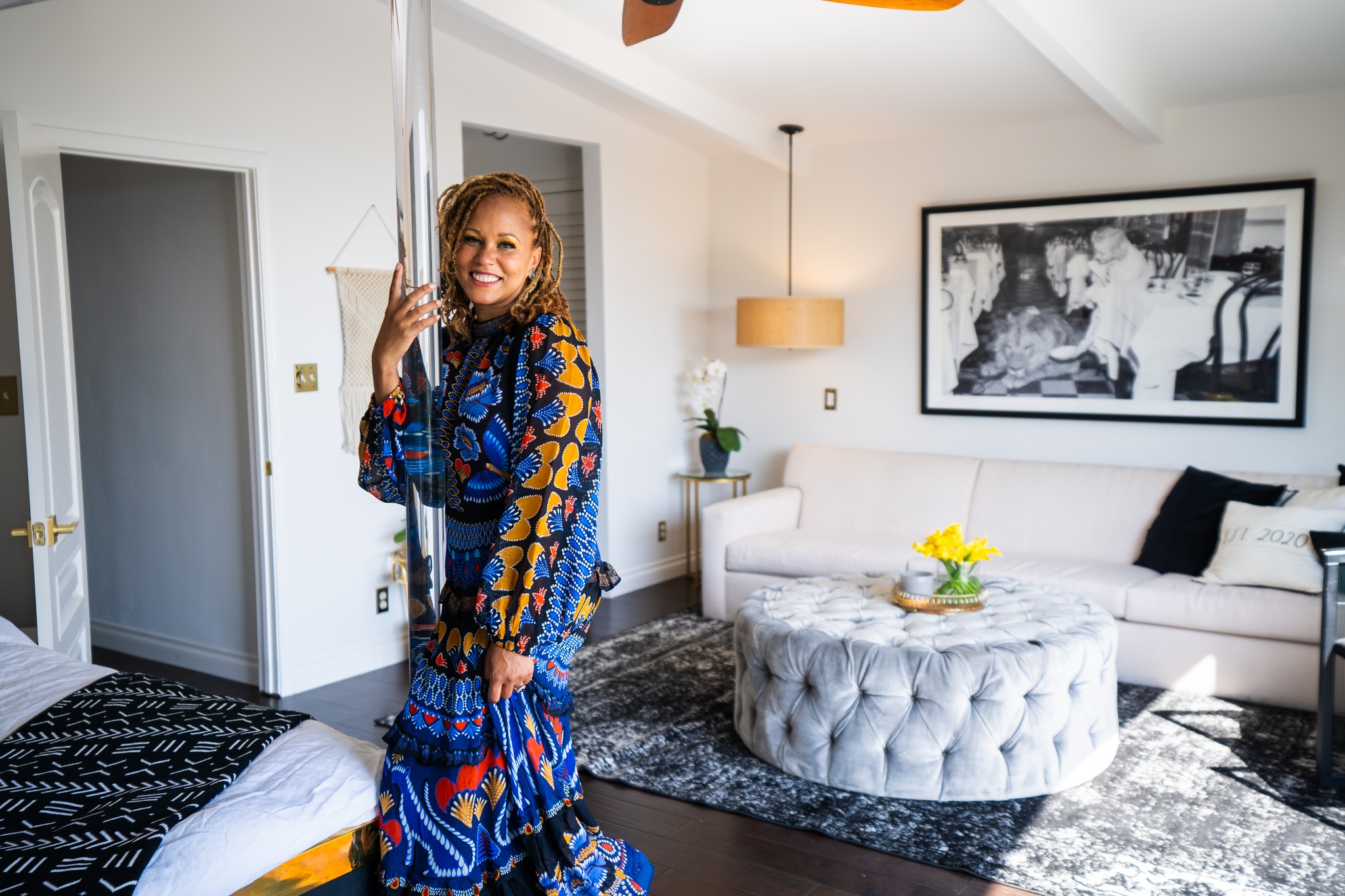
Are you following me on social media? If not, you absolutely should be! If you already do, then you’ve likely seen this bed (pictured above) in a couple homes I’ve designed. It is one of my favorite pieces, and it’s one of the most asked about and complimented pieces, too! I imagine this bed gets so much attention for all of the reasons I love it. It’s a neutral piece with a black headboard and footboard. The brass accents make the bed feel ultra luxe and sophisticated without being overly ornate. But the real star of the show is the lucite canopy! This bed has presence. It commands your attention and makes a statement, and it does all of that without dwarfing the room. We have lucite to thank for that!
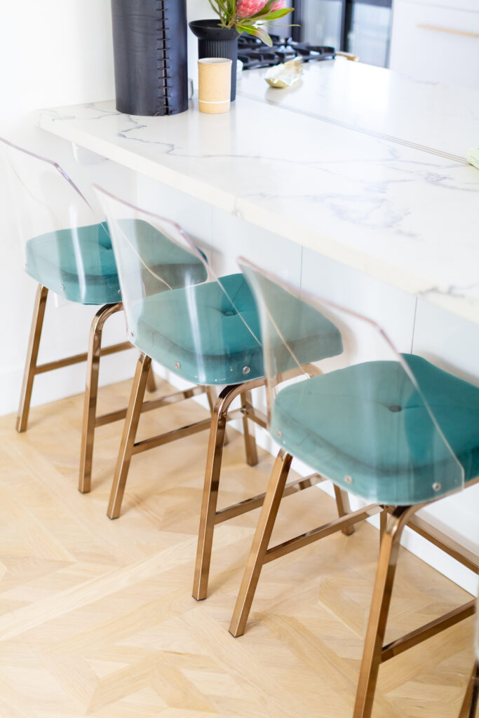
Lucite is durable and it doesn’t yellow when exposed to UVA rays. I love lucite because its clear composition allows it to play with the design of a space without interrupting the otherwise seamless look. It feels grand without looking heavy—the way a bed constructed of wood, particularly a darker wood, could. The other benefit to using lucite is that you never have to worry about matching it with your existing color palette. That’s definitely a win. I’ve used lucite in many different ways in design Another favorite would be barstools. Kitchen islands are great places to gather, and they’re often used for multiple purposes (homework, cooking, work stations, etc). Seating can be a bit of a challenge if you don’t have a ton of space, so arranging large stools in those areas can appear a bit cluttered to the eye. Swap out your wood or metal stool for lucite ones and add a colorful cushion for personality. You’ll instantly see the difference in the look and feel of the kitchen.
Functional, but Finished
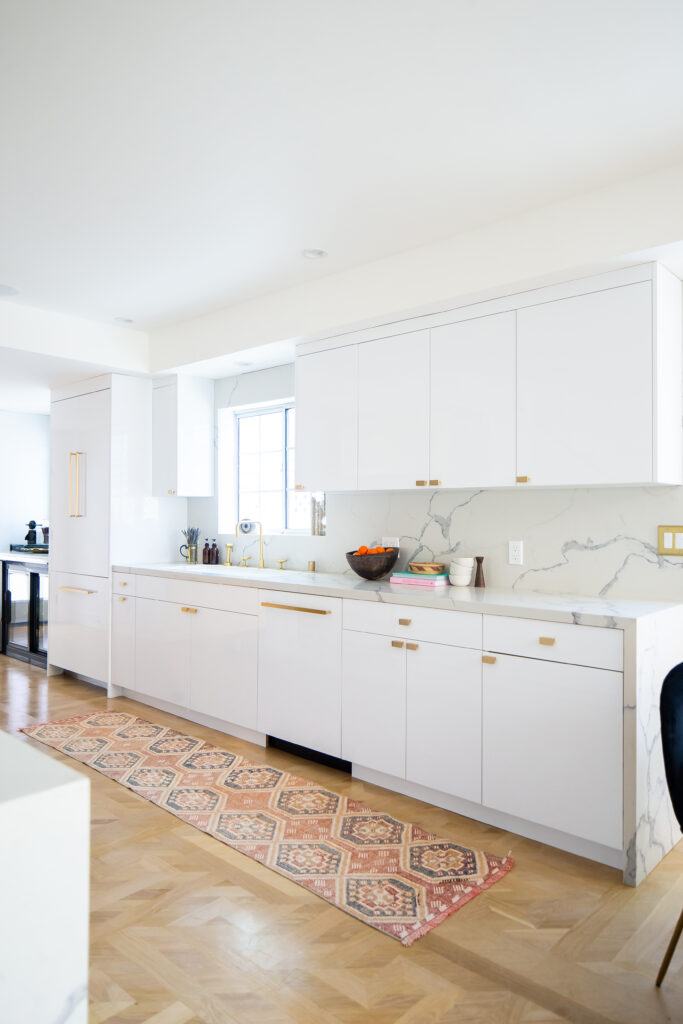
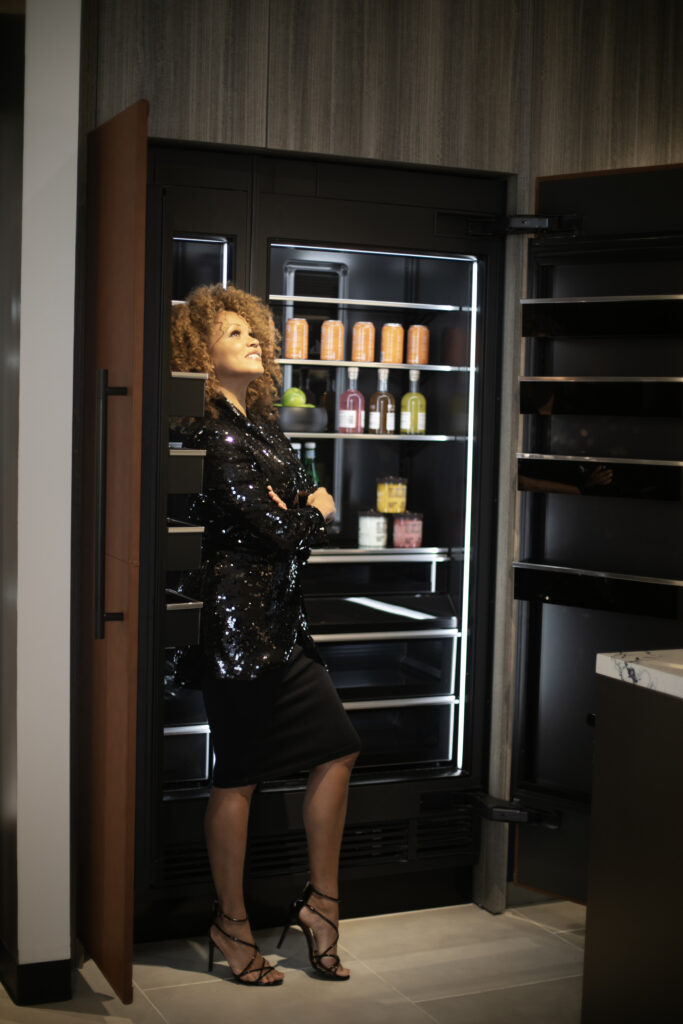
Kitchens are usually what people comment on when they’re thinking about remodeling, upgrading or buying a home. That’s understandable; after all, kitchens aren’t called the “heart of the home” for nothing, right? We spend so much time there, it makes sense to want these spaces to look their absolute best. If you’re wanting to give your space an easy facelift without embarking on a full on renovation journey, one of the things to consider is a panel ready fridge. These are refrigerators that allow you to cover the front with a “face” that matches the rest of that space. You can make them blend in so well that they almost appear hidden! It gives the space an refined look and keeps the design cohesive. Some companies, like Jennair, even allow for materials like stone or leather to grace the front for an especially custom experience.
Small Space Solutions: Interior Design Hacks
I am so excited to be introducing my new lighting line next year with Savoy House! I cannot wait to introduce you to what I’ve been working on. Lighting is so key to the design of a space because it determines how easily the space can be used, and it even determines the ambiance and vibe. I have always loved infusing spaces with beautiful fixtures. I even hung several chandeliers in my retail store as a teen! There’s just nothing like big, bold lighting fixtures hanging from the ceiling for maximum impact. But what happens when your space doesn’t allow for that?
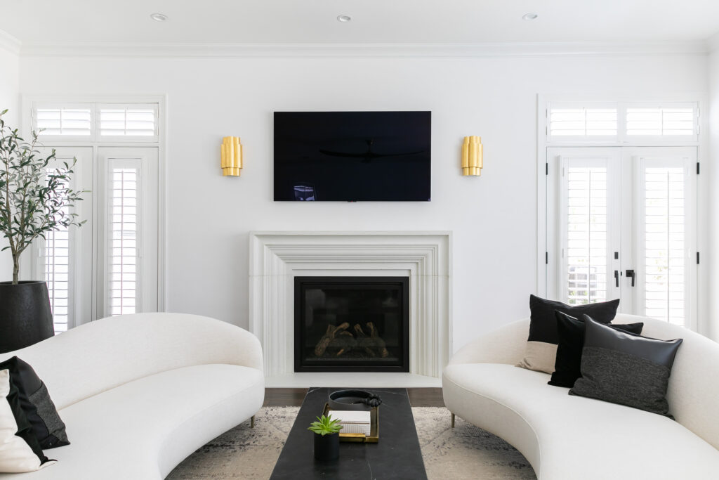
If you have a small room or lower ceilings, adding a ton of floor lamps will only make it feel smaller. Table lamps require…tables—something else you likely don’t have space for in a modestly sized room. So, what’s an interior design enthusiast to do? Sconces are an awesome way to add lighting to your rooms when you don’t want to use much space. They come in a variety of sizes, materials and colors, so you’ll be able to find ones that work well with your style. If you know Breegan, you know I favor brass and gold in pretty much everything metallic. I have used sconces in all types of rooms, and they never disappoint! Swap your floor lamp for a stylish sconce to save on space.
I could go on and on about easy swaps and interior design hacks to give your space a more modern and stylish look! No matter what you’re faced with, there is usually a solution that can be employed for a happier you, and better designed space. Contact me on The Expert today, and let’s schedule a virtual consultation. I’m excited to help you get the home you want and deserve!




replies (0)