Many of the most significant ways to change a space, shift a mood, or make a statement begin with one essential element: color. Think about it. How many times has your temperament for the day influenced what you chose to wear? We select cars, buy decor and paint our walls with the shade as a guide, whether we realize it or not. So diving deeply into why we feel drawn to a certain color or array of colors can help us understand how to use them wisely in design. My favorite color has been teal for quite some time now. I’ll let you in on why that is, in today’s blog.
Color as an Influence
Have you ever heard of the “Lipstick Effect”? In 2001, Estee Lauder’s lipstick sales soared despite the recession. This shocking fact led Leonard Lauder to coin the term that originated from the idea that even during difficult times, people still spend money on small luxuries like beauty products that make them feel good. Isn’t it interesting that of all the products their customers were purchasing, lipstick—something we immediately think of as a color-based cosmetic, was at the top? I think it’s because women realize how much a bright or muted color on the lips can completely change their appearance. The same can be said of other areas in our lives.
I think color is so impactful because it’s one of the elements that demands to be seen. You can’t change the color of something without people noticing. Color is eye-catching. When I’m designing a space it’s always at the forefront of my mind. So when I fell in love with teal, I knew there had to be a psychology around it.
My Favorite Hue
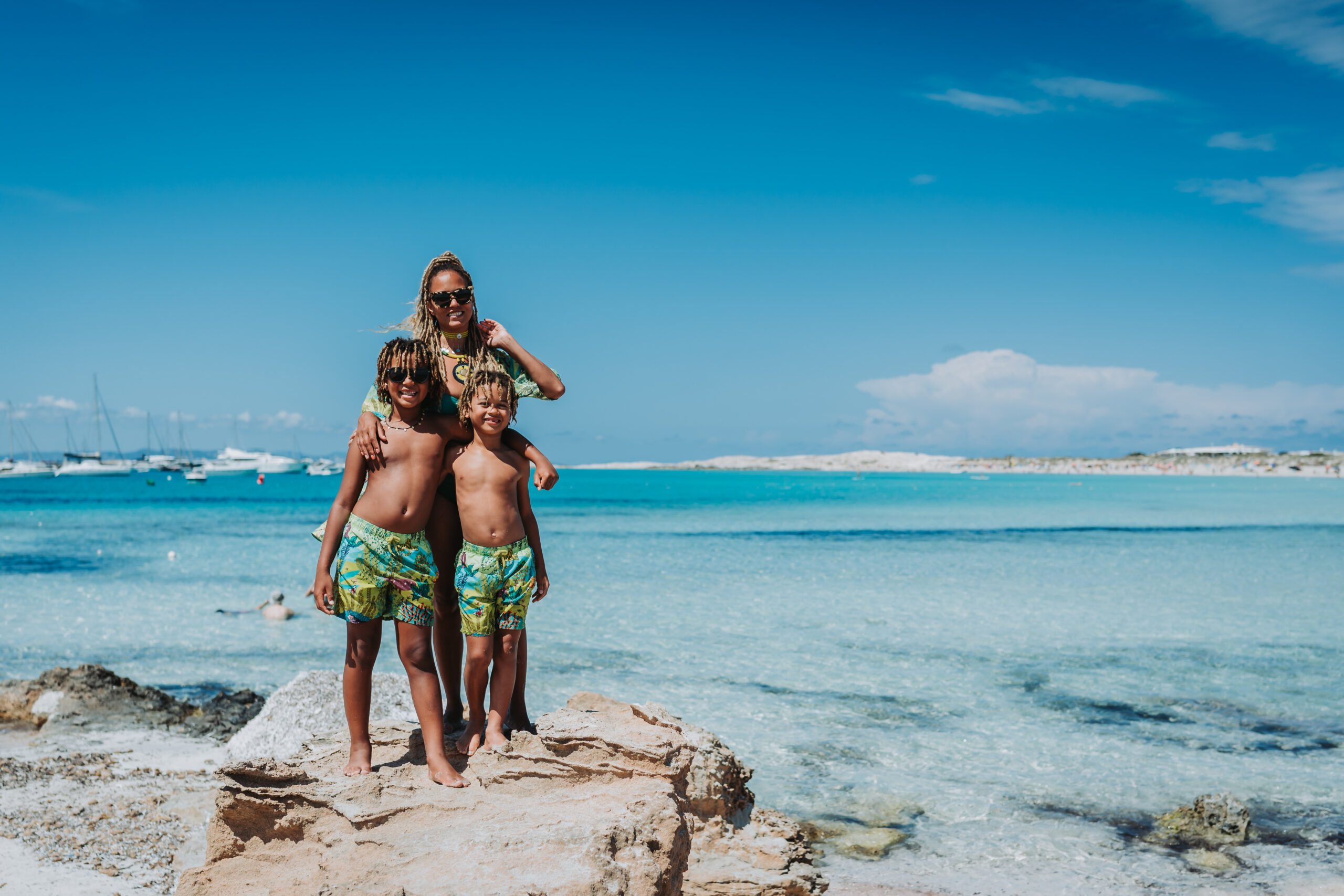
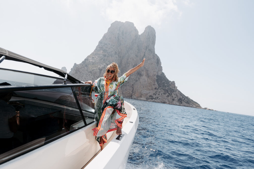
Anyone who knows Breegan is aware of my great love affair with Ibiza, Spain. My family went from short vacations to spending extended parts of the year in this beautiful place. Honestly, if I was to ever move away from my beloved California, it would be to live in Ibiza. The region is just stunning. It’s kid-friendly (don’t let the IG pages filled with nothing but partying fool ya!), it’s slower-paced, and the people are lovely. Each time I visit, I’m instantly more at peace. When I explored that a bit, I discovered a big part of that feeling was due to my aesthetically pleasing surroundings, which had a lot to do with—you guessed it, color!
Teal was everywhere. The ocean waters sparkled in the immersive hue like a shimmering mermaid’s tail. The sea itself is already beautiful, but it’s even more striking against the white architecture and sandy shore line. I’m always so relaxed once my feet hit the ground in this part of the Mediterranean.
Teal and other shades of blue seem to all have some sort of soothing effect. In fact, if you think of any resort brochure or website, or even your favorite spa, you’ll likely notice they all tend to include a good amount of blue tones. It’s because of the way these colors make us feel. Teal has a perceptible impact on our bodies and minds.
Interior Design and Teal
So, we have our favorite colors. What now? Well, the first thing is to determine how they affect your mood. That will become your guide on where and how to use them. If you love yellow because it energizes you, perhaps it would work well in an office space where you want to feel productive and awake. On the contrary, using that same color in a bedroom might be disastrous. Generally, we like our sleeping spaces to feel calm and serene. So a color like teal might work better there.
I want my home to be my sanctuary. I love neutrals because they make my always busy and working mind feel comforted by a non-cluttered space. Since there tends to be a lot of white and cream in my spaces, I knew my accent color would have to work well with that. The Ibizan landscape proved that teal would work perfectly.
Using Color as an Accent
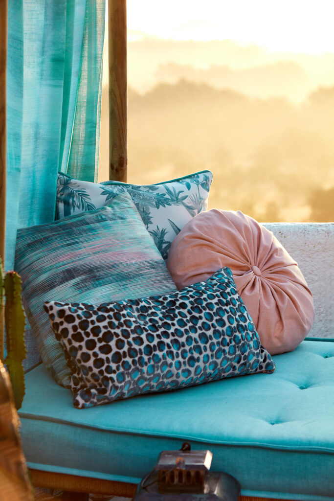
I infuse my spaces with my favorite color here and there in order to keep it neutral while also introducing vibrancy in conspicuous ways. One of easiest ways to do that is with throw pillows. I love mixing prints and patterns in similar colorways for a unique look.This is always a recommendation of mine because these types of decor can be easily switched out whenever the mood hits. Check out these examples from my line with Clarke and Clarke.
Another way to use your favorite color is with paint and wallpaper. I have used teal in many of my paint projects. I’ve done an ombre accent wall for a restaurant I designed. I’ve painted the walls of my office in a muted teal. I’ve even used it in a baby nursery. Each shade was different but equally beautiful.
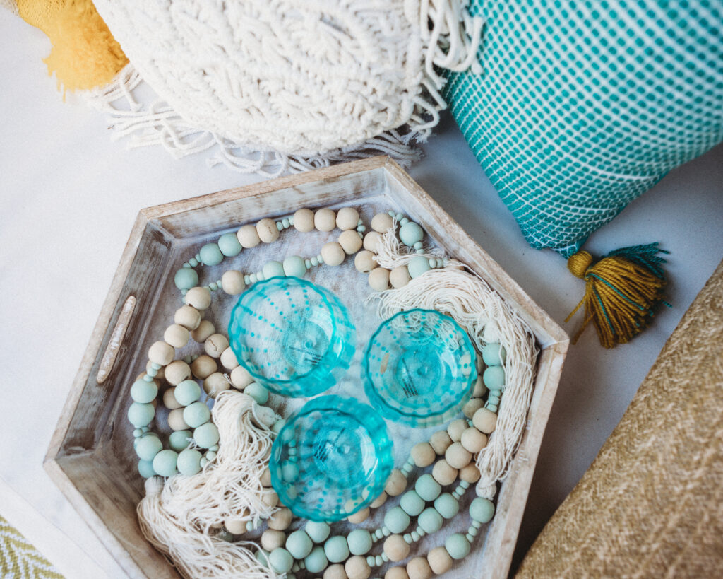
Maybe your favorite color isn’t one that you want in large doses. Choose smaller pieces and arrange them carefully in your rooms for an intentional look. I like using functional items like glassware to achieve this look. It’s unexpected but significant.
It doesn’t matter how you prefer to use your color of choice, only that it makes you happy where you put it. Teal will always read as tranquil and soothing to my soul. It will likely always find its way into my favorite spaces, and I love that it just screams “Breegan” when people see it! Let me know what your color is, and show me how you’ve incorporated it into your spaces.
replies (0)