It may come as no surprise that I’ve been working in creative fields since I was a kid! It’s true! HGTV and Food Network aren’t my first rodeos! Whether it was child modeling, painting and selling bookbags as a kid, owning my own retail store as a teen, or staging yachts early on in my career, creativity is something I just…get. So, when I got the call from Food Network to help another struggling bakery revamp their design to maximize selling potential, I was over the moon excited to help with innovative ideas! When I arrived in Livonia, Michigan, I was immediately struck with several ideas about how to improve the space. So, let’s talk about this week’s finale of Bake or Break!
Choosing the Correct Color in Retail Design
There’s a reason so many interior design tips involve the use of color. Interior design is largely visual, which means what we see when we first enter a space matters big time! We can use color to draw attention, to influence moods, and even to make a space appear larger or smaller. When I walked into Paris Bakery, I was instantly aware of how dark everything was. Kostas, the bakery owner, had painted the walls a deep red color. It was somewhere between brick and ruby. Now listen, I have nothing against red. But, I do think it can be tricky to use on walls. In fact, any darker color can be. The deep hue he’d chosen was making the space feel oddly closed in. It wasn’t the effect you want when the goal is getting customers to buy food and hang around for a while.

Full of inspiration, I sprang into action. When you’re designing a room, you always have to be careful to balance dark and light elements. It’s part of the reason why tuxedo kitchens work so well. Light usually opens up a space, while dark has the opposite effect. Keeping your walls light will trick the eye into thinking the room is bigger than it actually is, something you can benefit from in a smaller space like this bakery. We set out with a plan to brighten the entire place with a fresh coat of white paint, and the result was exactly what I hoped for!
Always Take Advantage of Natural Light
As I surveyed the space, I realized that a part of a wall jutted out in a way I’ve seen several times before. I instinctively knew (I mean, I am a designer!) that could mean a window was hiding beneath. A little investigating, (read: pounding through the wall) and we struck gold! Turns out there were windows after all! One of the biggest tips I can offer anyone looking to make a space feel open and spacious is to harness all the natural and artificial light you can. Whether I’m designing for someone on HGTV or Food Network, I always look to see how I can either arrange pieces for the best ambient light, or select lighting fixtures that will mimic natural light in order to create a welcoming space. To me, one of the most impactful changes we made to the bakery was giving it the ability to be bright and airy. Consider that if you’re buying a home, refreshing a room, or designing a retail space.
Personalize Your Space With Custom Design
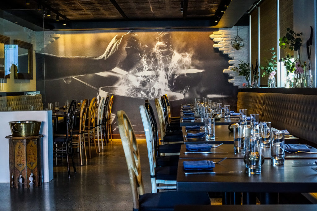
Even after we brightened the bakery with windows and paint, it was still lacking something. Kostas was clearly very passionate about making this business. He felt strongly about what he had built, and he wanted it to be a success. His employees were dedicated and talented. Yet, the space seemed to lack personality. Design should be memorable. When I’ve designed restaurants in the past, I wanted to include touches that would make patrons think back to the amazing meals they enjoyed there. Interior design is powerful! I once took an image of a chef’s hands at work creating her culinary masterpiece, and made IT into a masterpiece! I enlarged it big enough to cover an entire wall, and it became a feature of the space. It was amazing to see the spirit and soul of the restaurant in art that way. I knew I could do the same for Kostas.
When I looked at the signage outside of the bakery, I felt inspired by the name. I thought about Belle Isle, a place known as the jewel of Detroit. We were able to find a beautiful print and turn it into wallpaper for the bakery. This simple but clever touch not only pleased Kostas, it gave the bakery life! My signature design style is modern approachable luxury. The luxury part is often in the customization that I aim to infuse in my designs. When you want to elevate the design of a space, think about the ways you can tailor it to you. That can be with custom finishes, colors, artwork or even appliances. With this art on the walls, this bakery would always feel a little more special than it did before. A bit of history mixed into the design? That’s a win.
Get Rid of Clutter in Your Space
If you watched this episode of Bake or Break on Food Network, you know the first impression of this bakery wasn’t a great one! There just seemed to be junk everywhere! Both Stephanie and I felt like the “stuff” overwhelmed the small space and took up precious real estate. After listening to the vision Kostas had of Paris Bakery being more like a café and having seating for customers, I knew we had to find a way to declutter the main area. I took the mismatched food cases and swapped them for matching ones. Next, I focused on configuration. We needed a free area for a bit of seating for customers. We easily did that by arranging the cases around the exterior of the room. Now, all of the “stuff” that was contributing to clutter was hidden to anyone who walks in!
Hidden Storage is Your Friend
I’m a fan of making furniture multi-purpose. We all lead busy lives. We need our homes and other spaces to work for us, not against us. Whether I’m designing a bedroom, baby nursery or retail space, I look for ways to incorporate hidden storage. Is your space full of items that you need, but don’t need (or want) to necessarily see each day? Use large baskets with lids! These are great because they’re attractive, and you can put them anywhere. We use them in our home to house blankets when we want to curl up on the couch. I also like pieces like ottomans that open to storage. I like using these for parents because they’re perfect for stashing diapers or wipes in places where moms always need them. When you use furniture items this way, you can clear space for a more aesthetically pleasing design with ease!
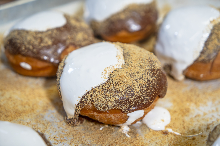
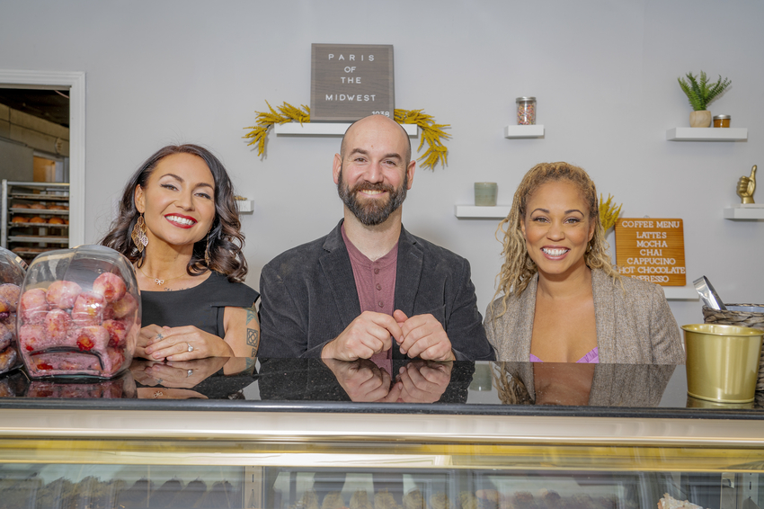
The transformation of Paris Bakery was amazing. We took this dark and bland space and turned it into a gorgeous, bright and spacious store that felt fresh again. Stephanie helped Kostas and staff come up with delectable additions to the menu, and the entire feeling of the space was rejuvenated. If you haven’t already, check out Bake or Break on Food Network or discovery+. It’s sure to bring a smile to your face!



replies (0)